SAME CAMPAIGN DIFFERENT HEADACHES
SAME CAMPAIGN DIFFERENT HEADACHES

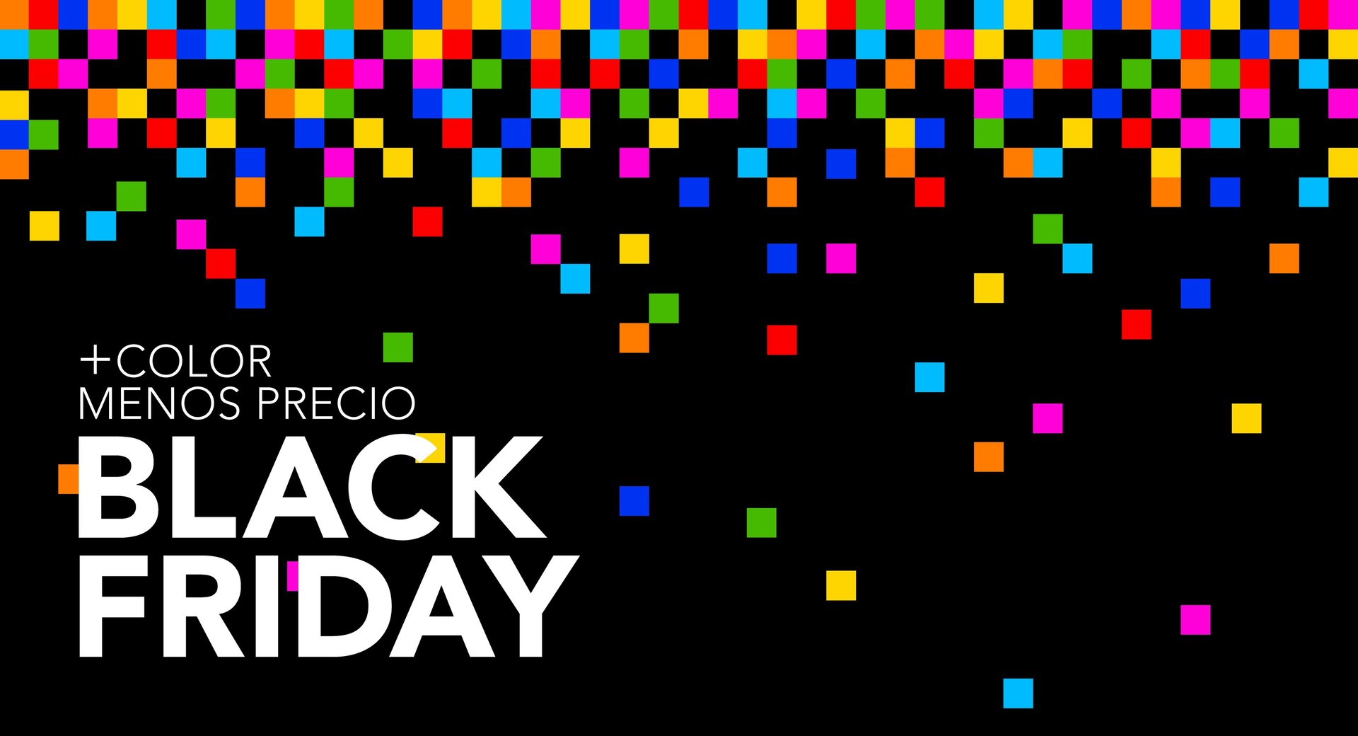
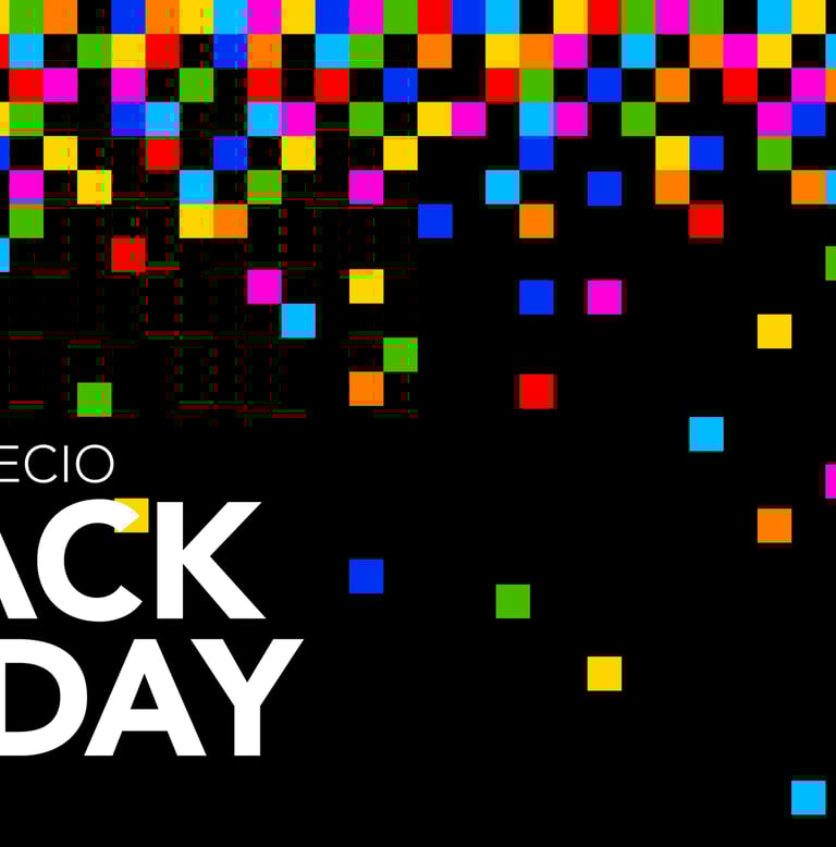
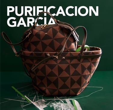
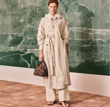
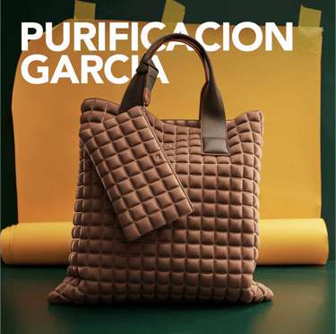
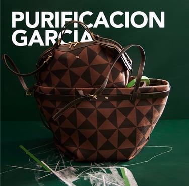
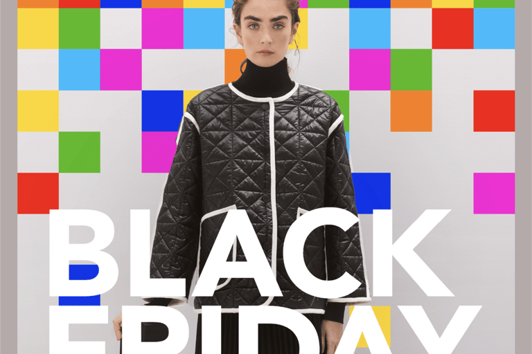
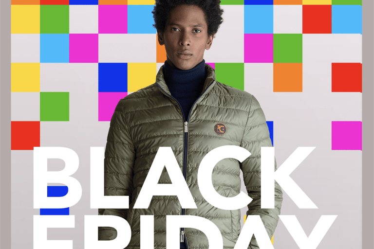
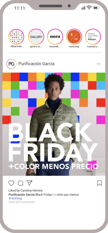
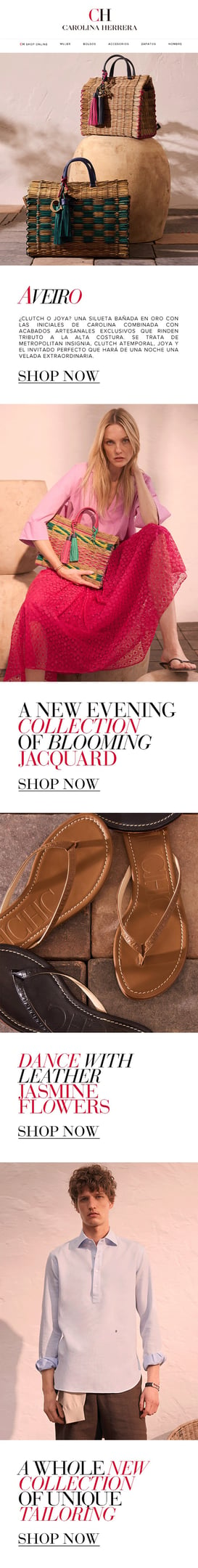
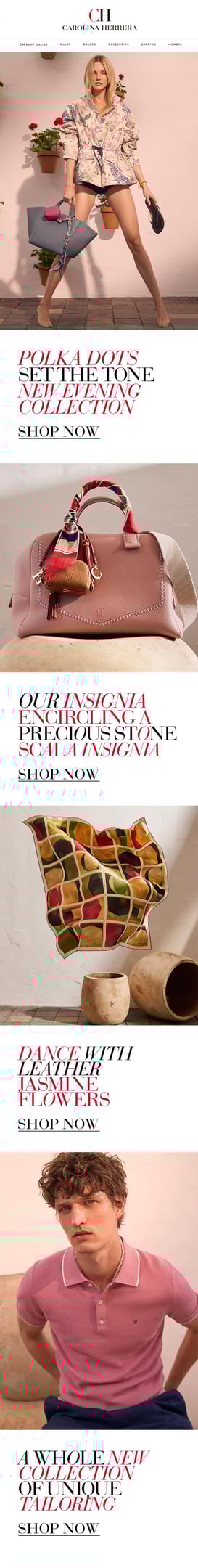
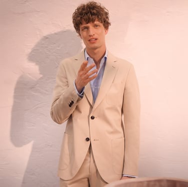
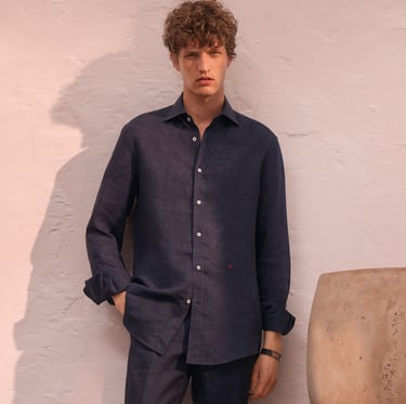
Black Friday reimagined through the visual universe of Purificación García. The campaign takes the cube, a key brand symbol, and transforms it into a grid of color "pixels" that invades every channel. Geometry, primary color and visual rhythm to translate discount into graphic impact, without losing identity
BLACK FRIDAY
PURIFICACION
GARCIA (2025)
01


My role spanned from content strategy to conceptualization and creative execution, in collaboration with the marketing, sales and e-commerce teams. All assets were adapted to the specific needs of each market, maintaining a shared but flexible visual system.
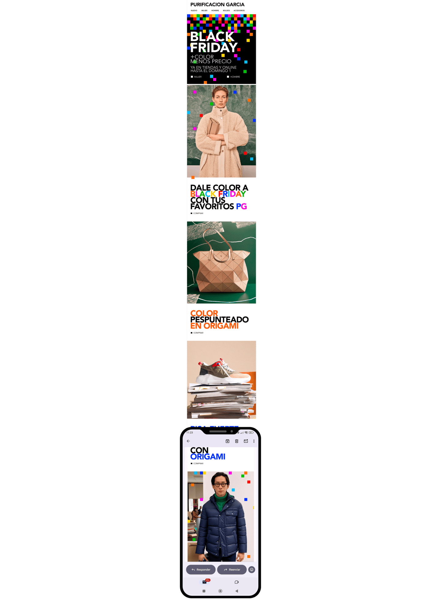
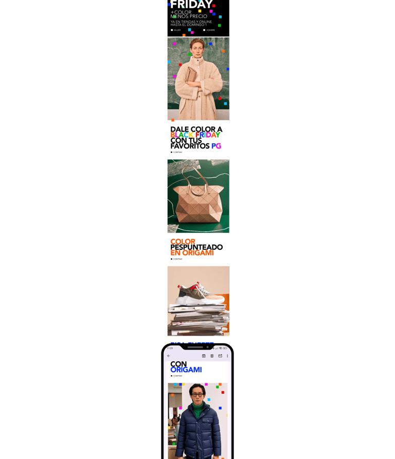
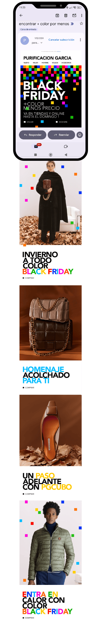
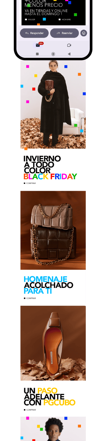
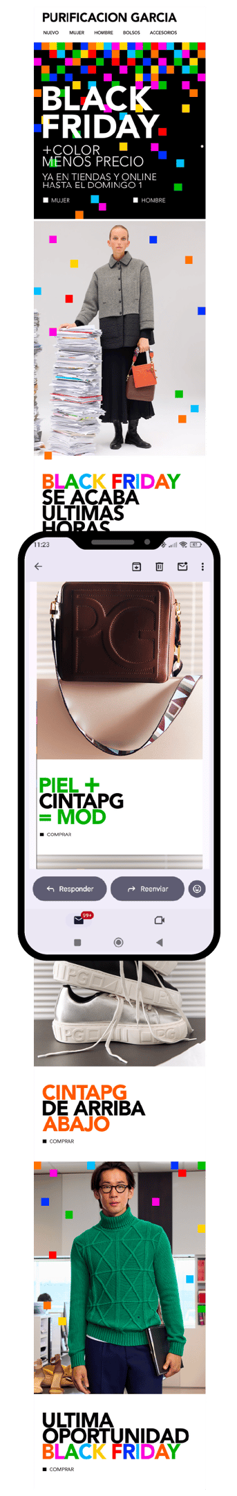
A clean and recognizable design, where brand colors and geometry create visual tension and direct attention to the key campaign message. Hierarchy, legibility and visual consistency are maintained across both desktop and mobile.


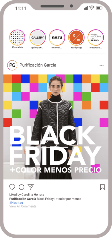
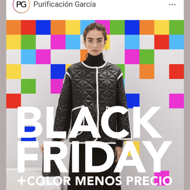
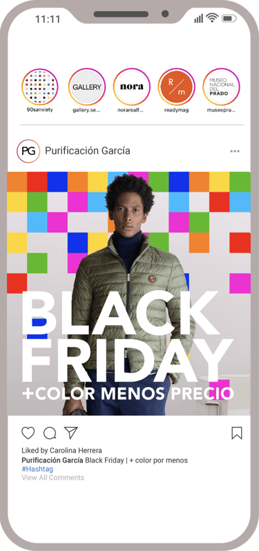
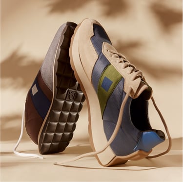
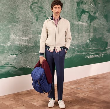
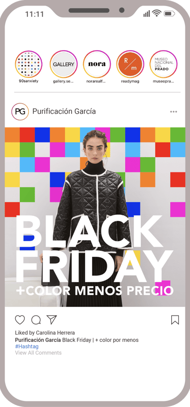
Design of advertising carousels and stories for Instagram, Facebook and Pinterest, built from the same graphic system. The product approach is adapted to each market and target audience, while maintaining the visual language of the campaign.


The result: highly recognizable creatives, designed to stand out in the scroll and reinforce the brand even in a saturated environment.


Black Friday reimagined through the visual universe of Purificación García. The campaign takes the cube, a key brand symbol, and transforms it into a grid of color "pixels" that invades every channel. Geometry, primary color and visual rhythm to translate discount into graphic impact, without losing identity.
BLACK FRIDAY
PURIFICACION
GARCIA (2025)
01
My role spanned from content strategy to conceptualization and creative execution, in collaboration with the marketing, sales and e-commerce teams. All assets were adapted to the specific needs of each market, maintaining a shared but flexible visual system.

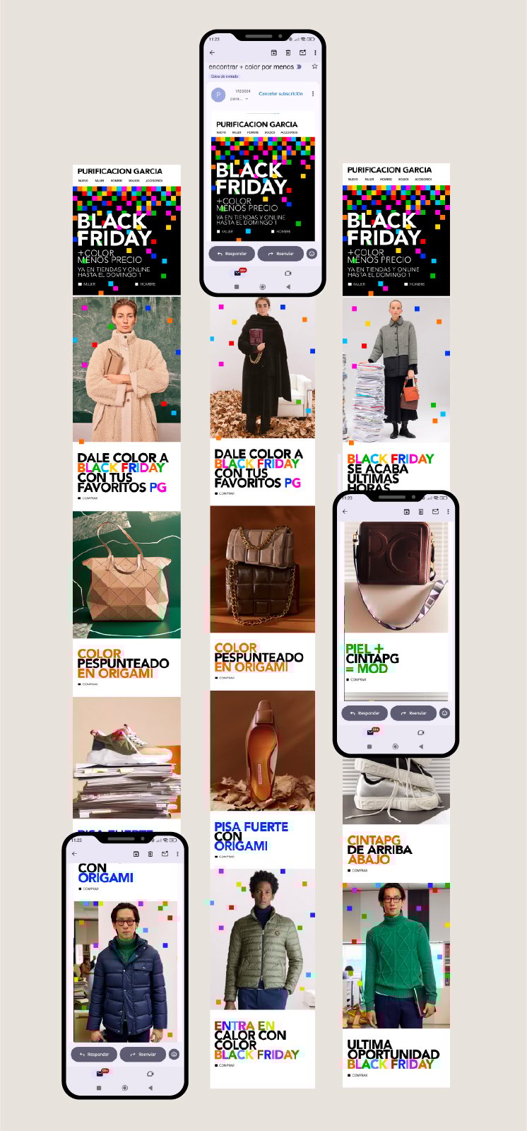
A clean and recognizable design, where brand colors and geometry create visual tension and direct attention to the key campaign message. Hierarchy, legibility and visual consistency are maintained across both desktop and mobile.
Design of advertising carousels and stories for Instagram, Facebook and Pinterest, built from the same graphic system. The product approach is adapted to each market and target audience, while maintaining the visual language of the campaign.
The result: highly recognizable creatives, designed to stand out in the scroll and reinforce the brand even in a saturated environment.


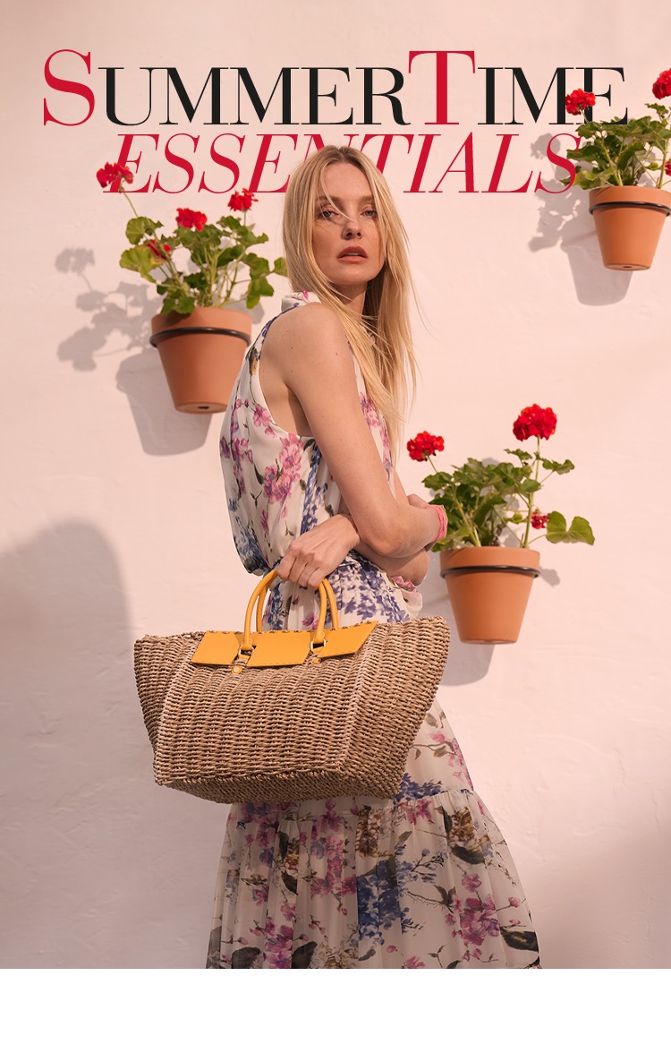
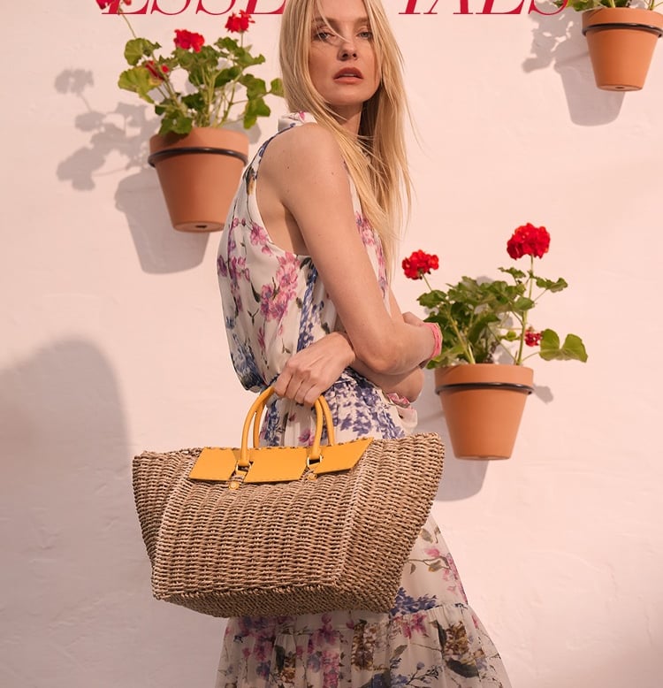
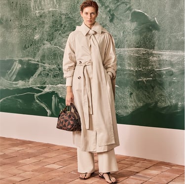
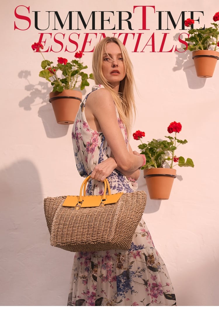
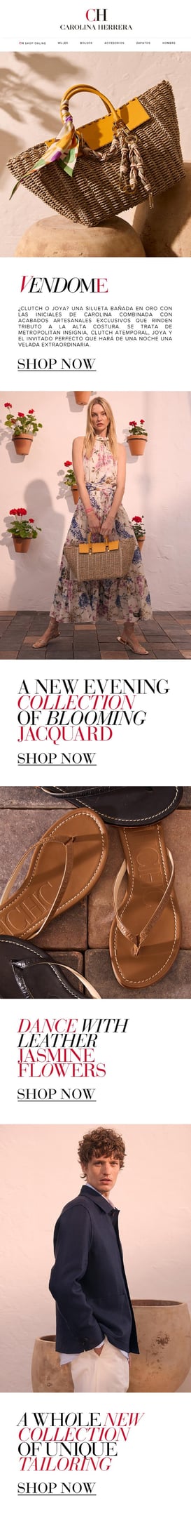
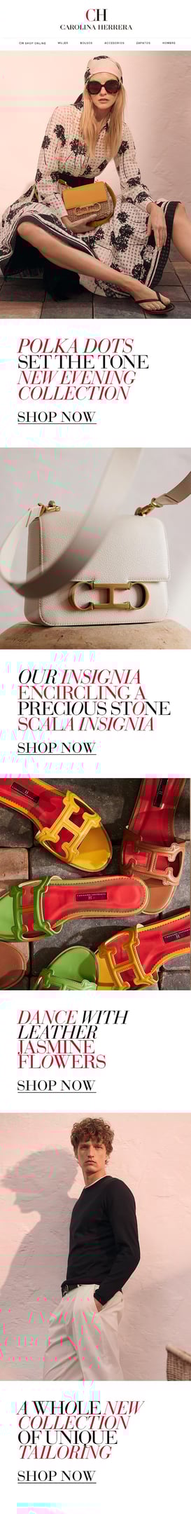
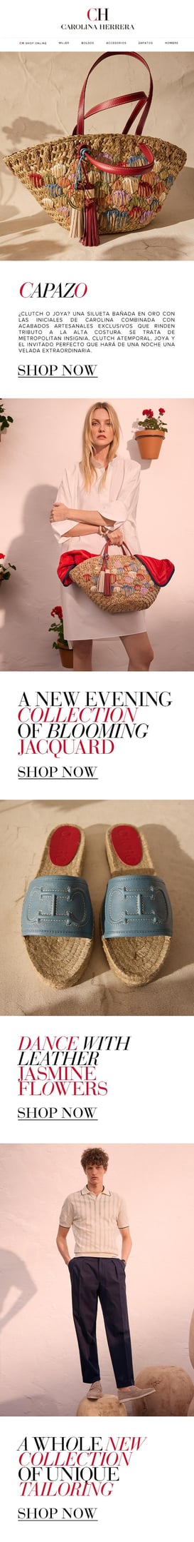
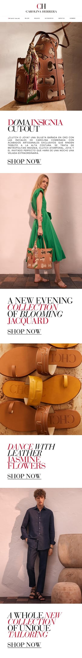
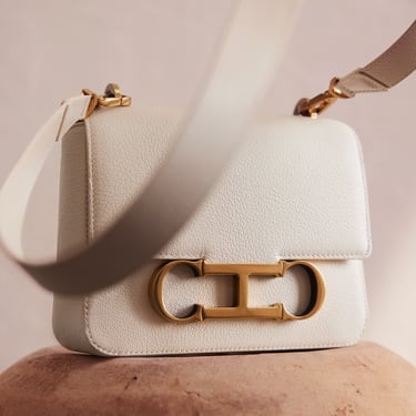
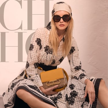
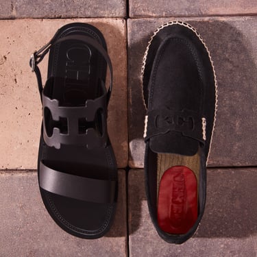
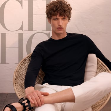
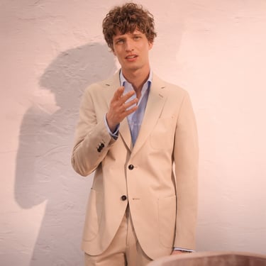
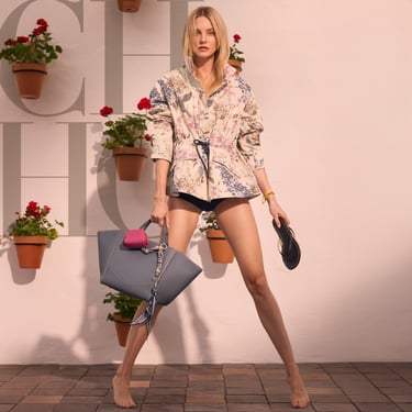
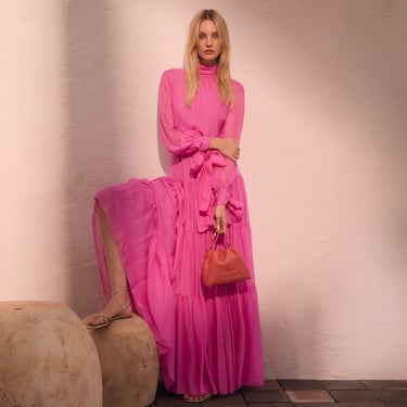
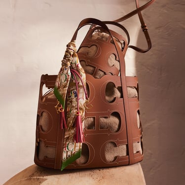
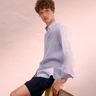
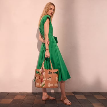
Tight deadlines, Andalusian patio aesthetics, and a campaign built on desire rather than hard sell. Summertime was never about pushing product, it was about making people want a lifestyle, and letting the bags speak for themselves.
As a graphic designer bridging creative execution and content strategy, my role lived in the balance between aesthetics and commercial priorities. Working from the image department alongside ecommerce and sales, I was part of a highly iterative process, from initial moodboard to final pixel.
SUMMERTIME
CAROLINA
HERRERA (2025)
02
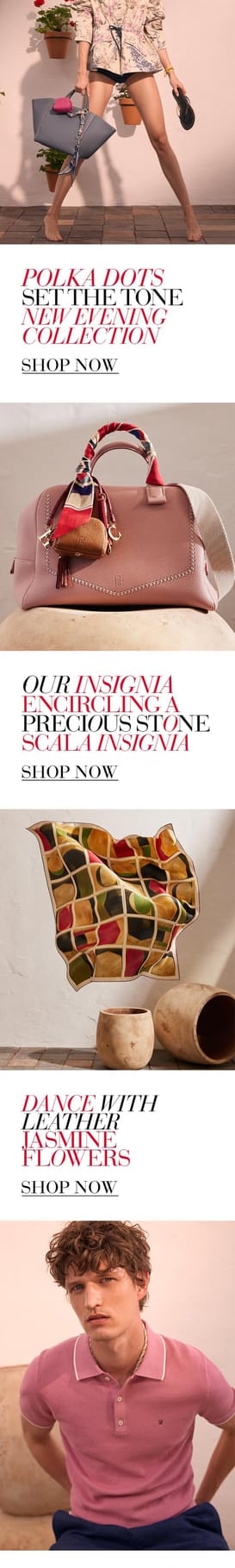

The campaign spanned homepage grids, newsletters, social media, paid ads, editorial spreads, events invitations, and custom landing pages for the top-performing retail malls. Every format had to feel connected, elevated, and unmistakably Herrera.
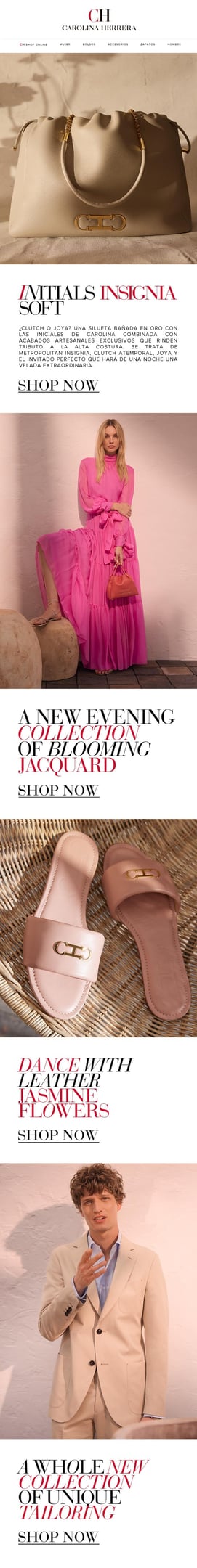


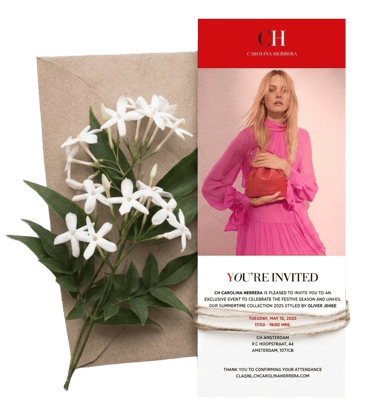
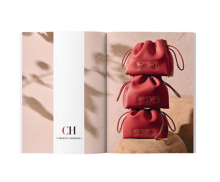

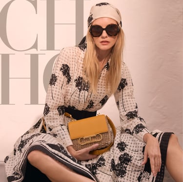


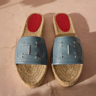
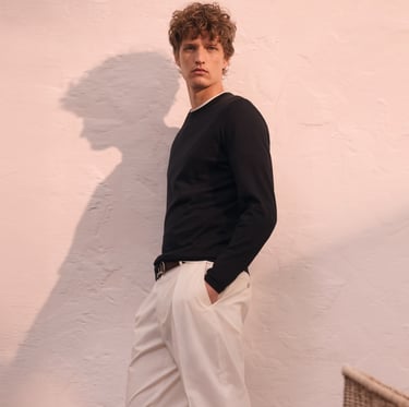


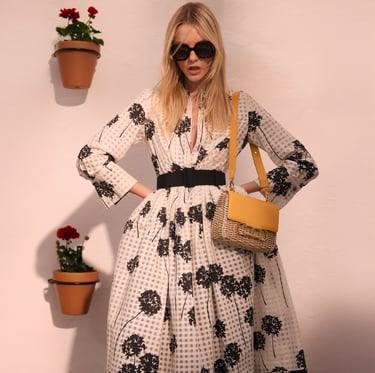
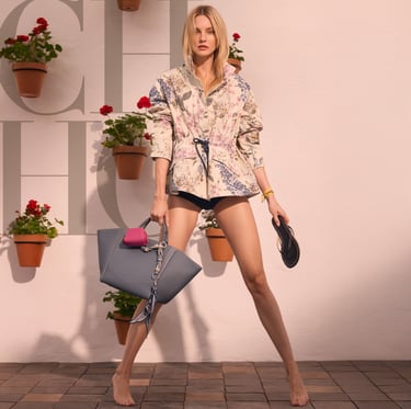
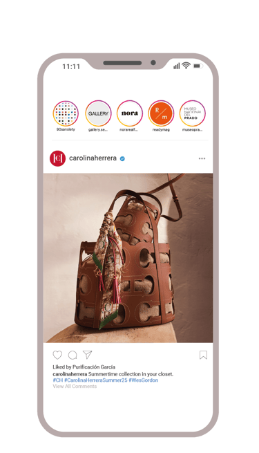
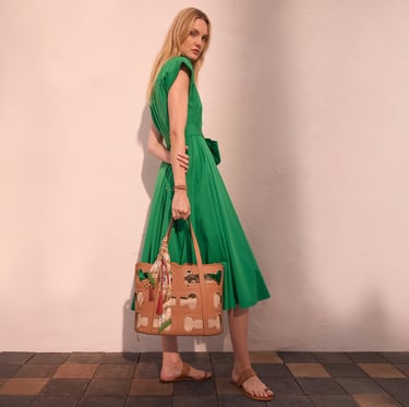
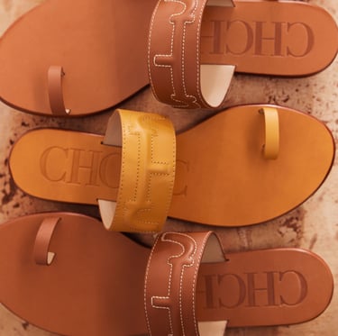
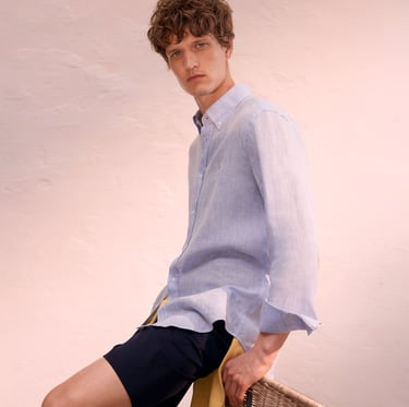
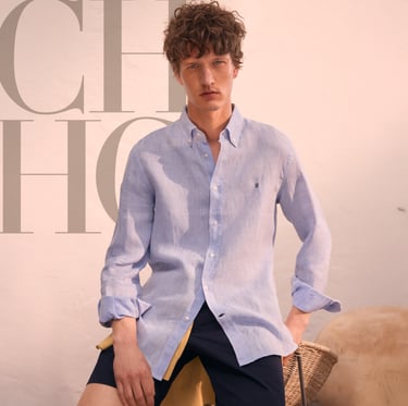
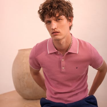
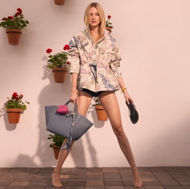
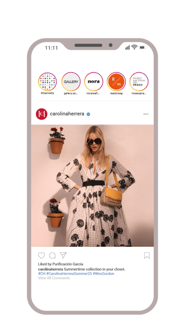

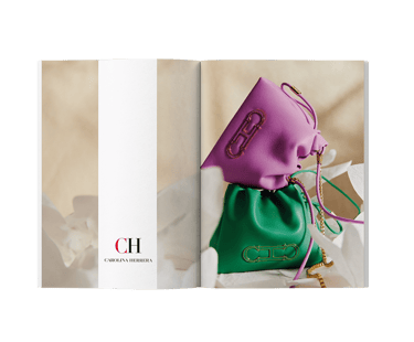
The campaign launched on time, performed consistently across all channels, and drove a 23% increase in bag sales compared to the previous year's summer campaign. More than numbers though, it cemented the summer bag as a seasonal must-have within the brand's universe.
Tight deadlines, Andalusian patio aesthetics, and a campaign built on desire rather than hard sell. Summertime was never about pushing product, it was about making people want a lifestyle, and letting the bags speak for themselves.
As a graphic designer bridging creative execution and content strategy, my role lived in the balance between aesthetics and commercial priorities. Working from the image department alongside ecommerce and sales, I was part of a highly iterative process, from initial moodboard to final pixel.
SUMMERTIME
CAROLINA
HERRERA (2025)

The campaign spanned homepage grids, newsletters, social media, paid ads, editorial spreads, events invitations, and custom landing pages for the top-performing retail malls. Every format had to feel connected, elevated, and unmistakably Herrera.
The campaign launched on time, performed consistently across all channels, and drove a 23% increase in bag sales compared to the previous year's summer campaign. More than numbers though, it cemented the summer bag as a seasonal must-have within the brand's universe.
02


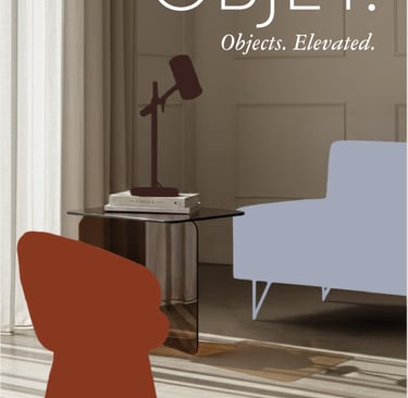
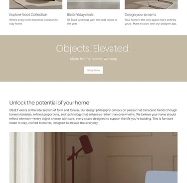
Translating OBJET's rebrand into real touchpoints: Social content, brand collateral and Black Friday campaign assets. Built in record time using a hybrid AI workflow.
Deliverables: Landing page, digital banners, social posts, brochure, fake UGC content.
Tools: Photoshop, Ideogram, HeyGen, Kling AI, Figma, Nano Banana and Claude.
The approach: AI handled volume and iteration. I handled curation, refinement, and final composition.
03
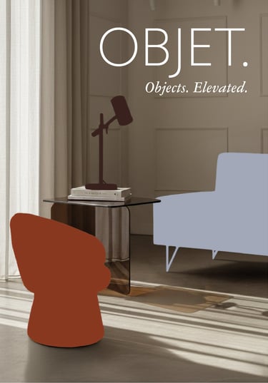
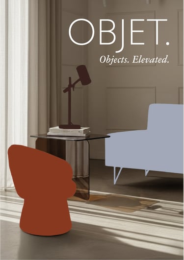
OBJET
AI POWERED
BRAND
APPLICATIONS
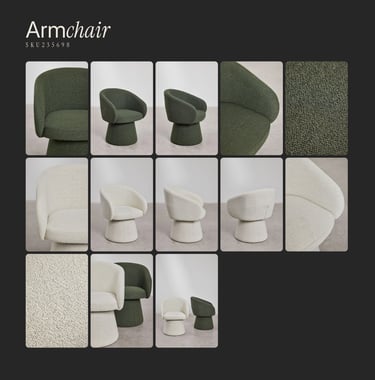


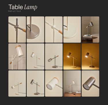
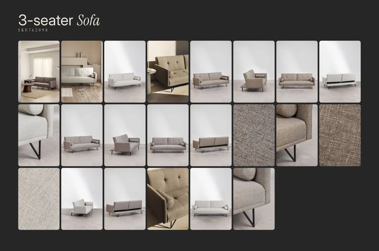

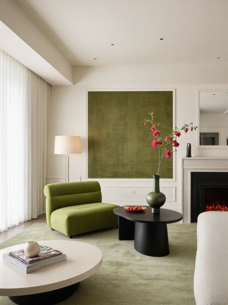
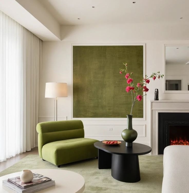
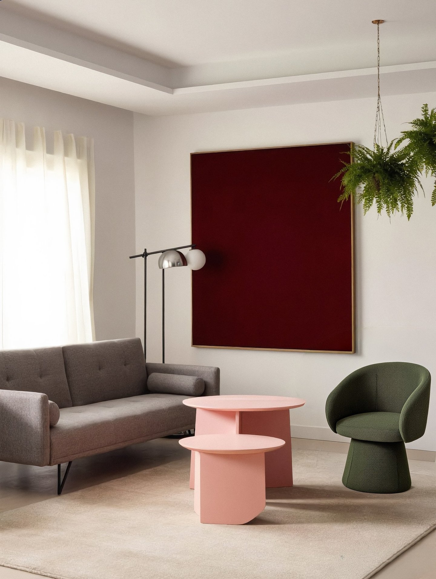
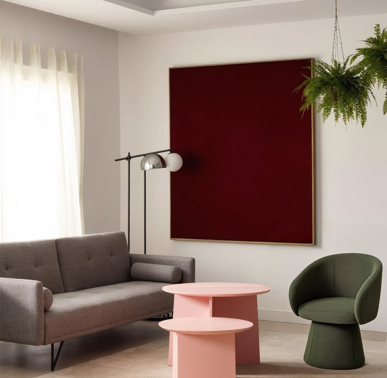
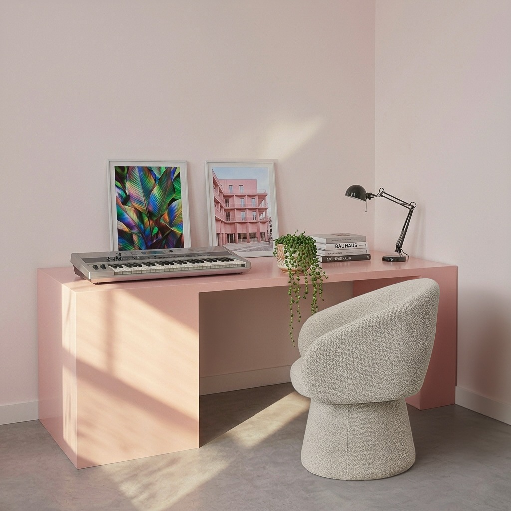
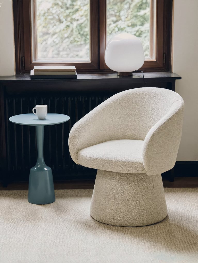
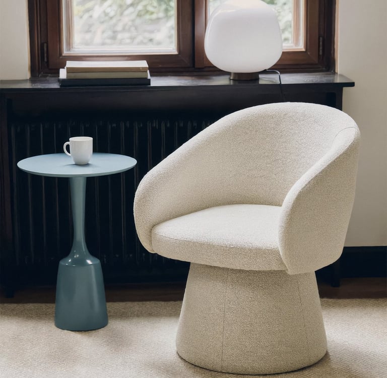
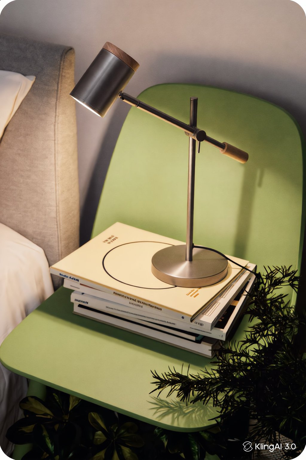
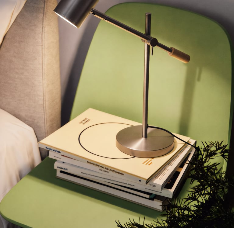
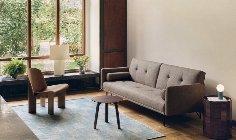
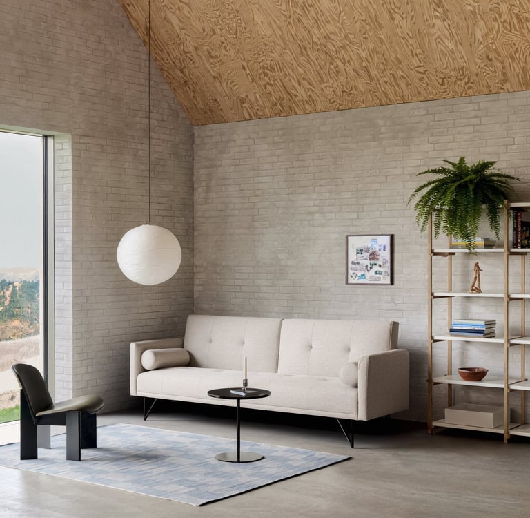
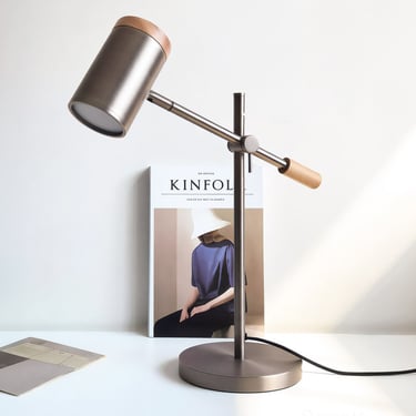
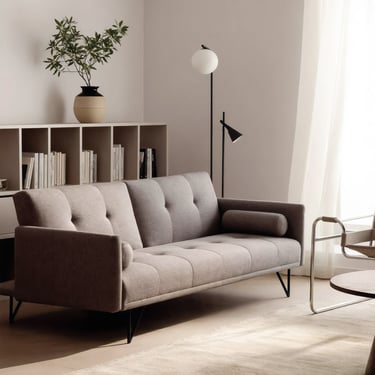
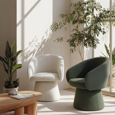
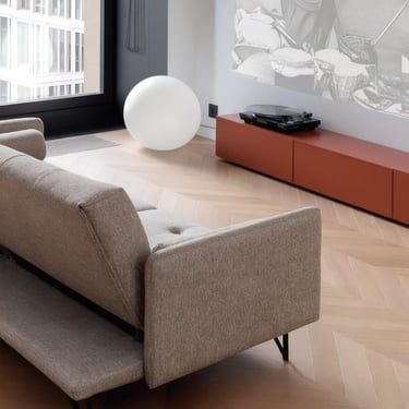
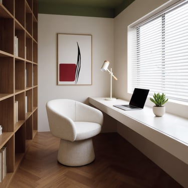
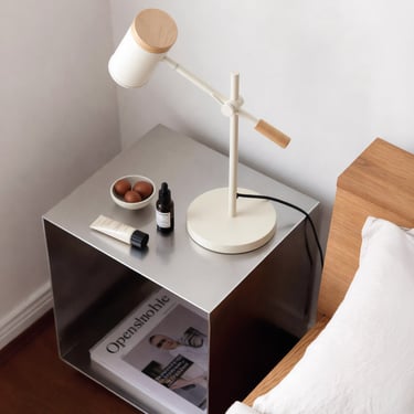
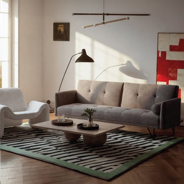
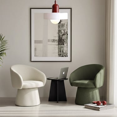
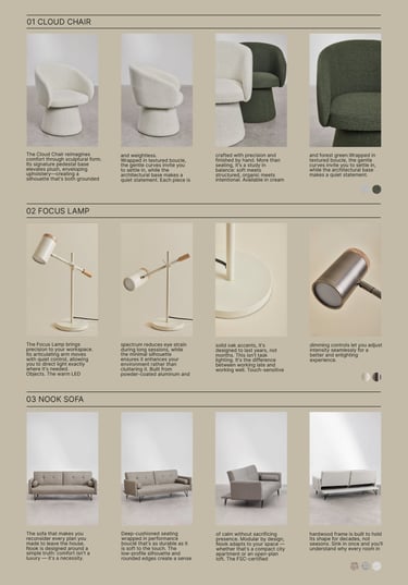
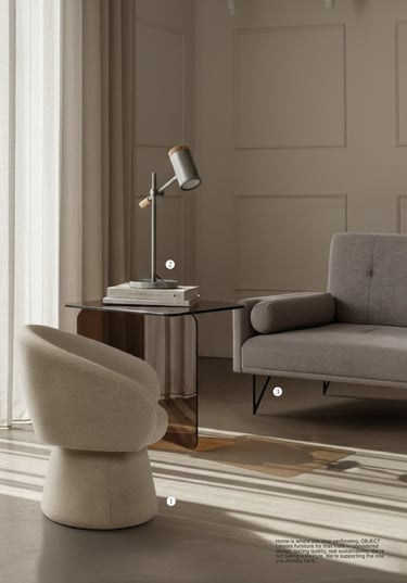
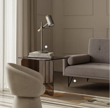
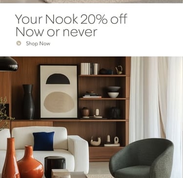
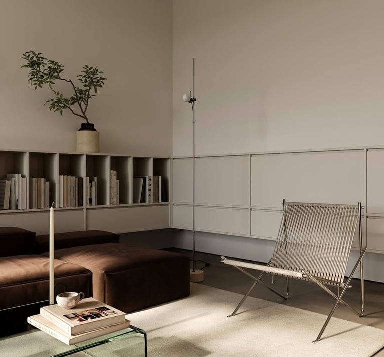
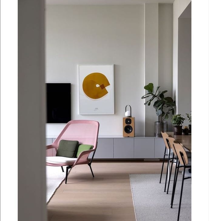
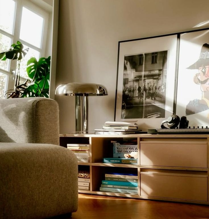
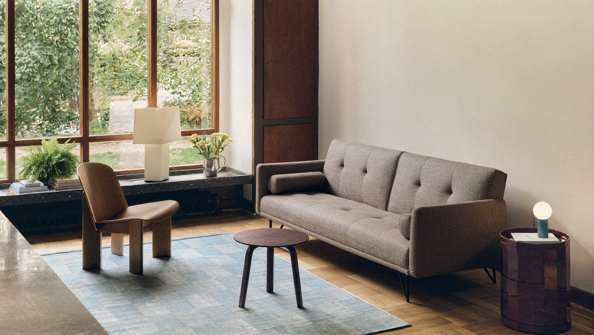
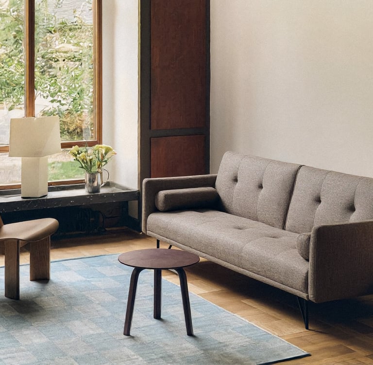
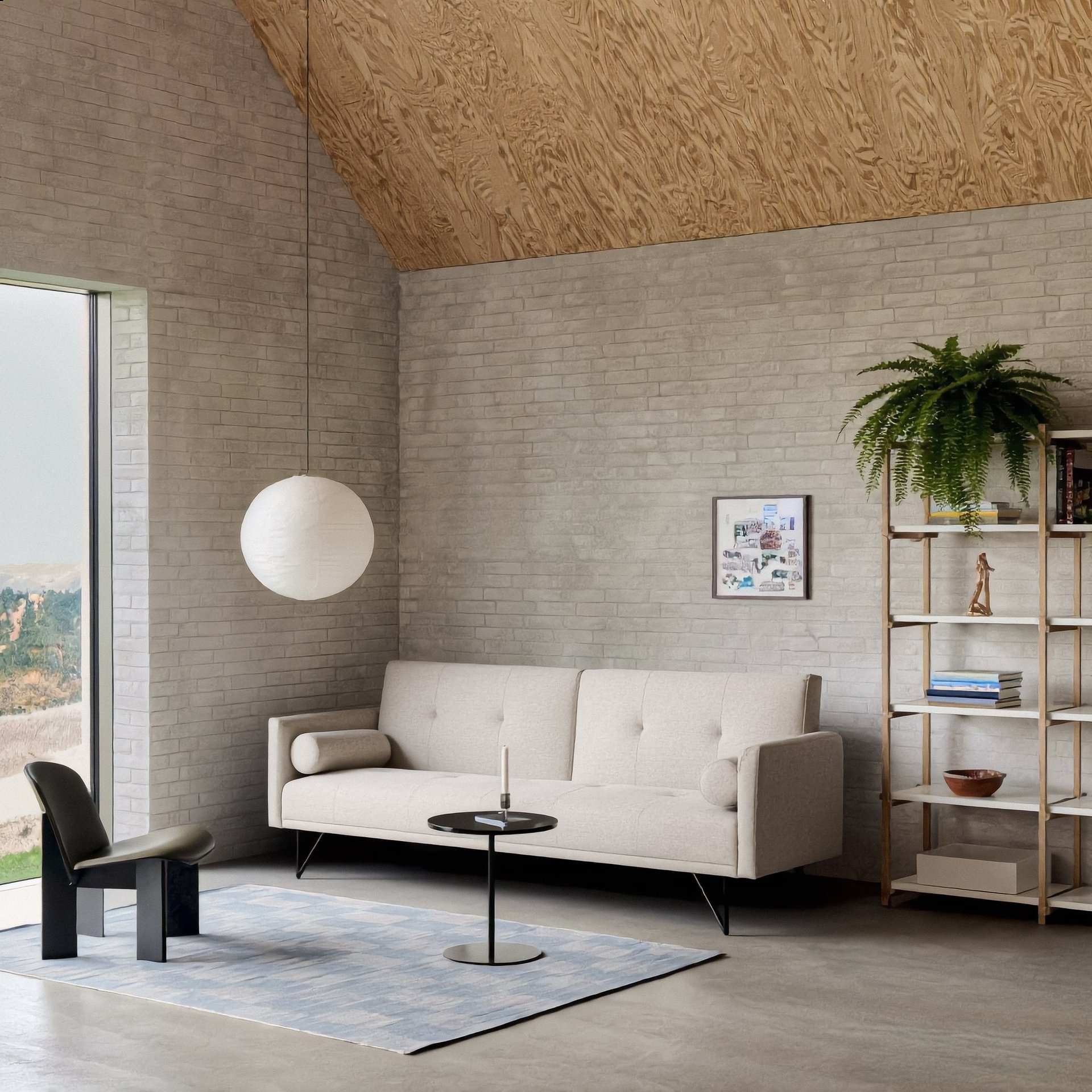
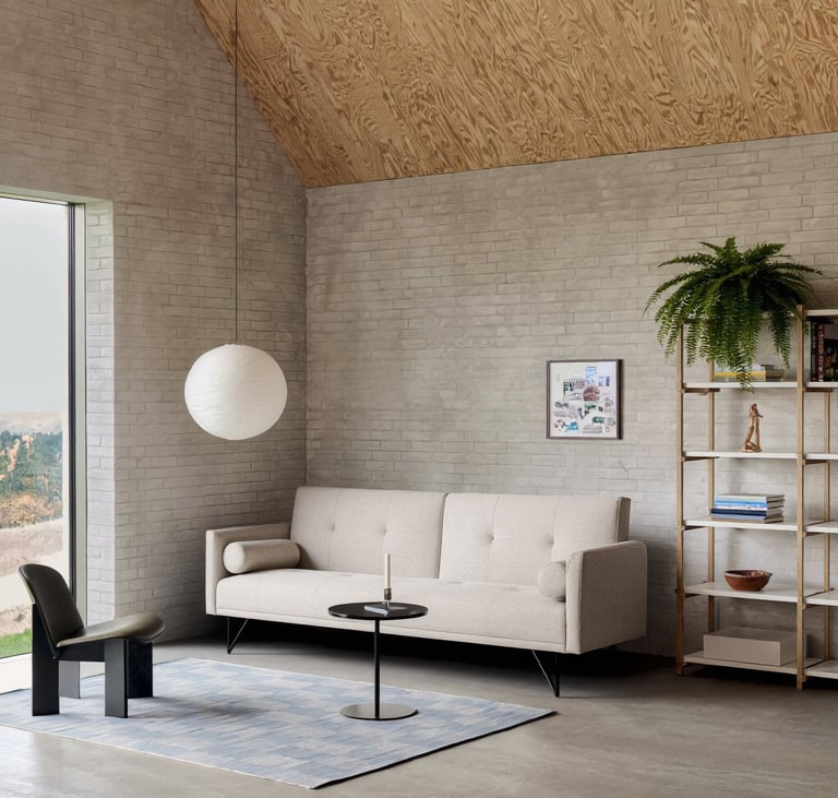
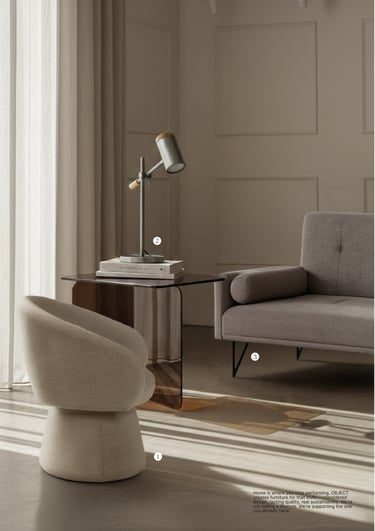
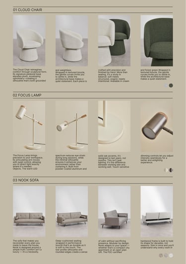
OBJET provided studio shots of 3 SKUs (3-seater sofa, table lamp and an arm Chair). The challenge: place them in realistic lifestyle contexts that felt premium, not generic AI.
The problem is that most AI tools generate product + background together, visually coherent but spatially inconsistent. You can't get the same living room from three angles for different products.
PRODUCT IMAGERY
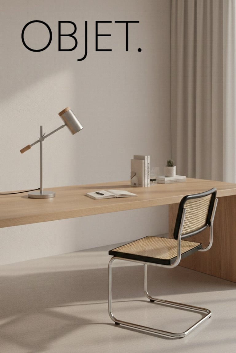
Solution: Ideogram generated base scenes (empty interiors). Photoshop inserted products with precision. One aesthetic template, multiple SKUs. Visual consistency without chaos.
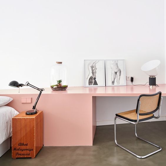
REFINED SMART BIOPHILIA
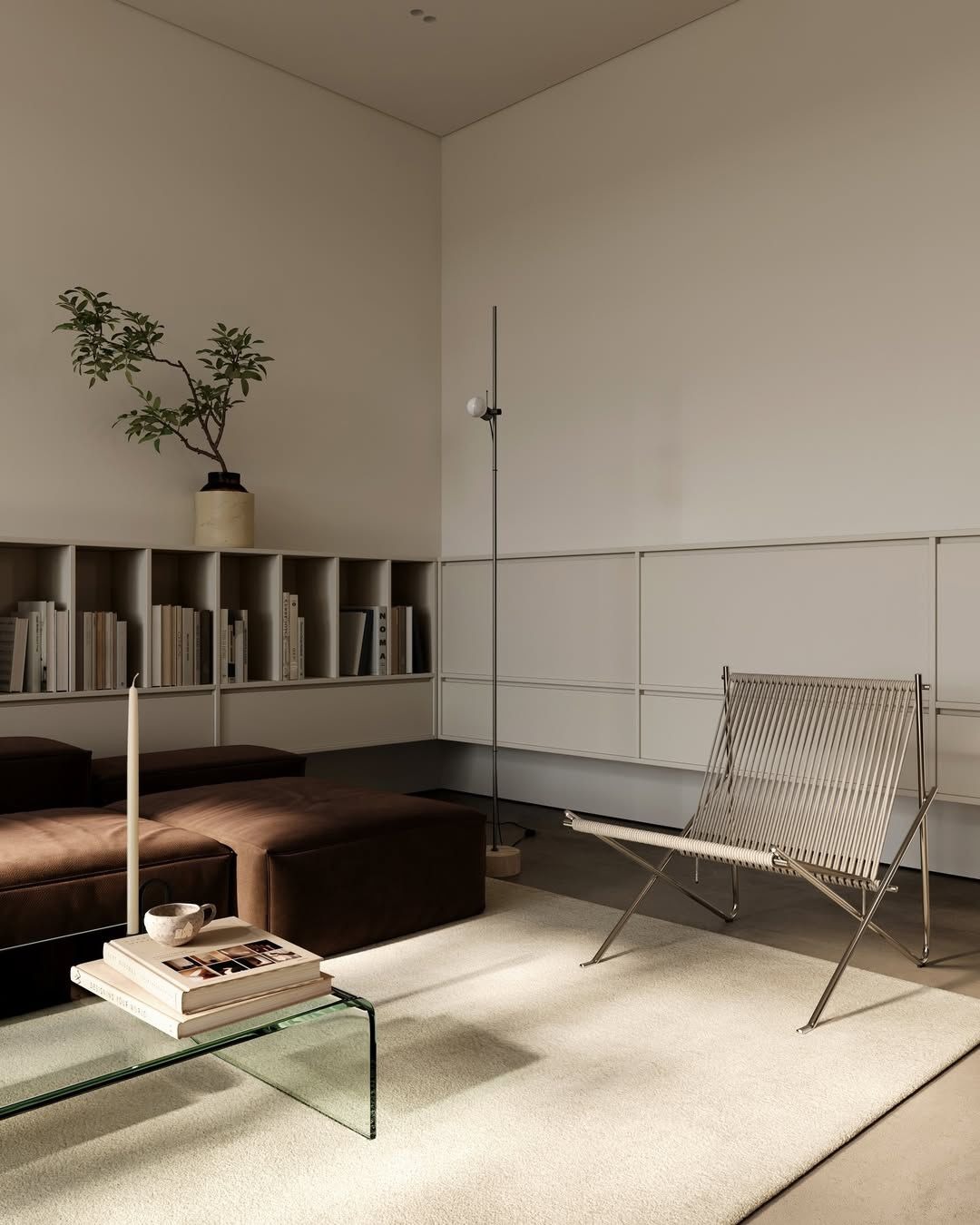
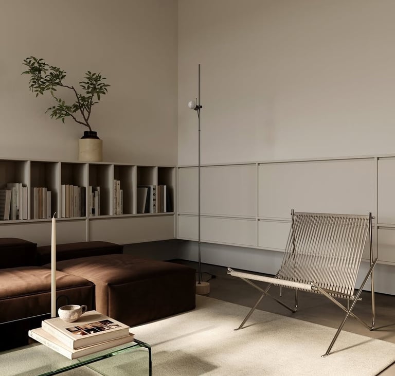
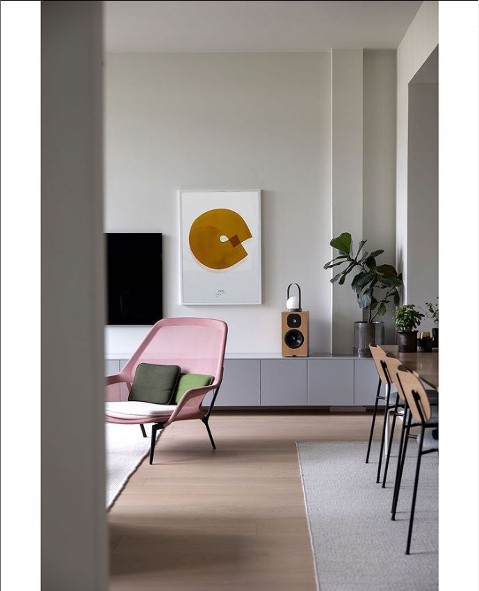

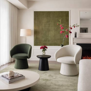
Before generating images, I defined art direction grounded in target insights and competitive gaps. A visual language that signals sophistication, modern life and sustainability.
-Tech devices: Target's tech interest + normalizes where people actually work and live.
-Plants: Sustainability, quiet presence.
-Natural materials: Validates quality (light wood, veined stone).
-Soft natural light: Afternoon warmth, long shadows.
-Cultural signals: Design books, minimal ceramics, taste indicators.
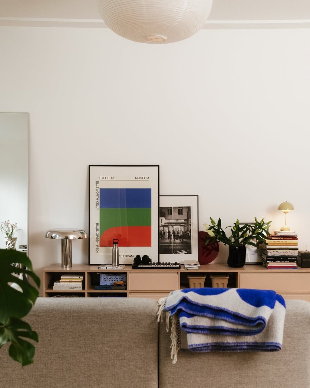
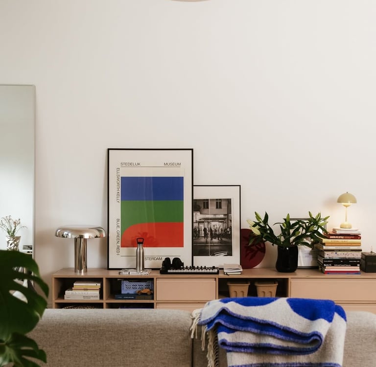
Product shots provided:
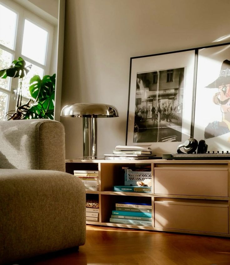
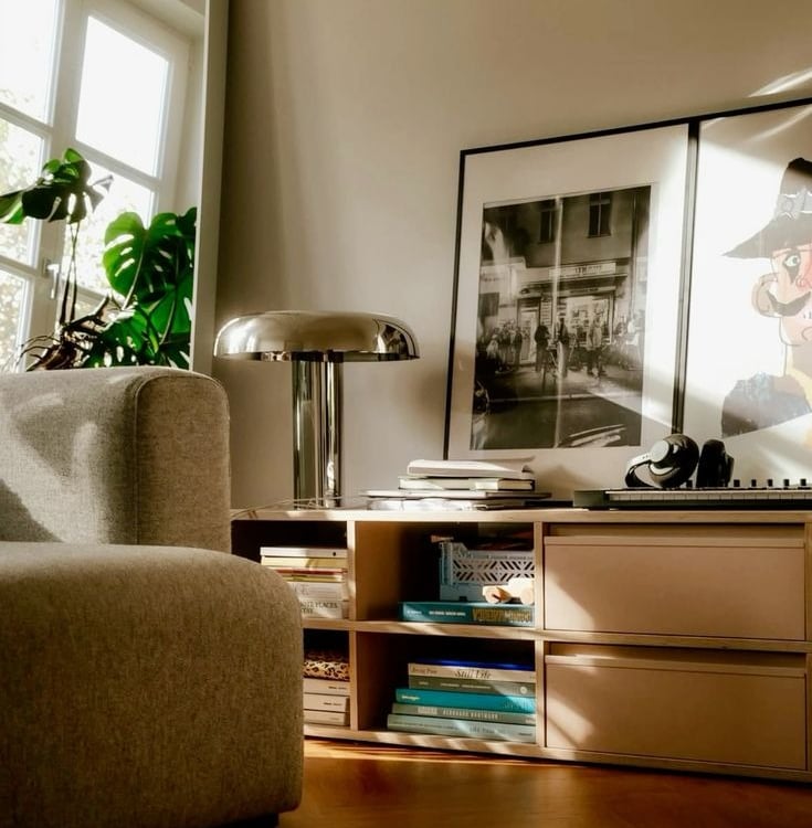
References:
Generations:


SOCIAL MEDIA CONTENT
IG Feed with generated content:
Social media is where brand systems get stress-tested. This feed was built using AI generated imagery, but the real work was editorial: deciding what fits, what doesn't, and why. Consistent enough to feel like a brand. Varied enough to not feel like a template. Somewhere, a production team of twelve is very confused about where their jobs went.

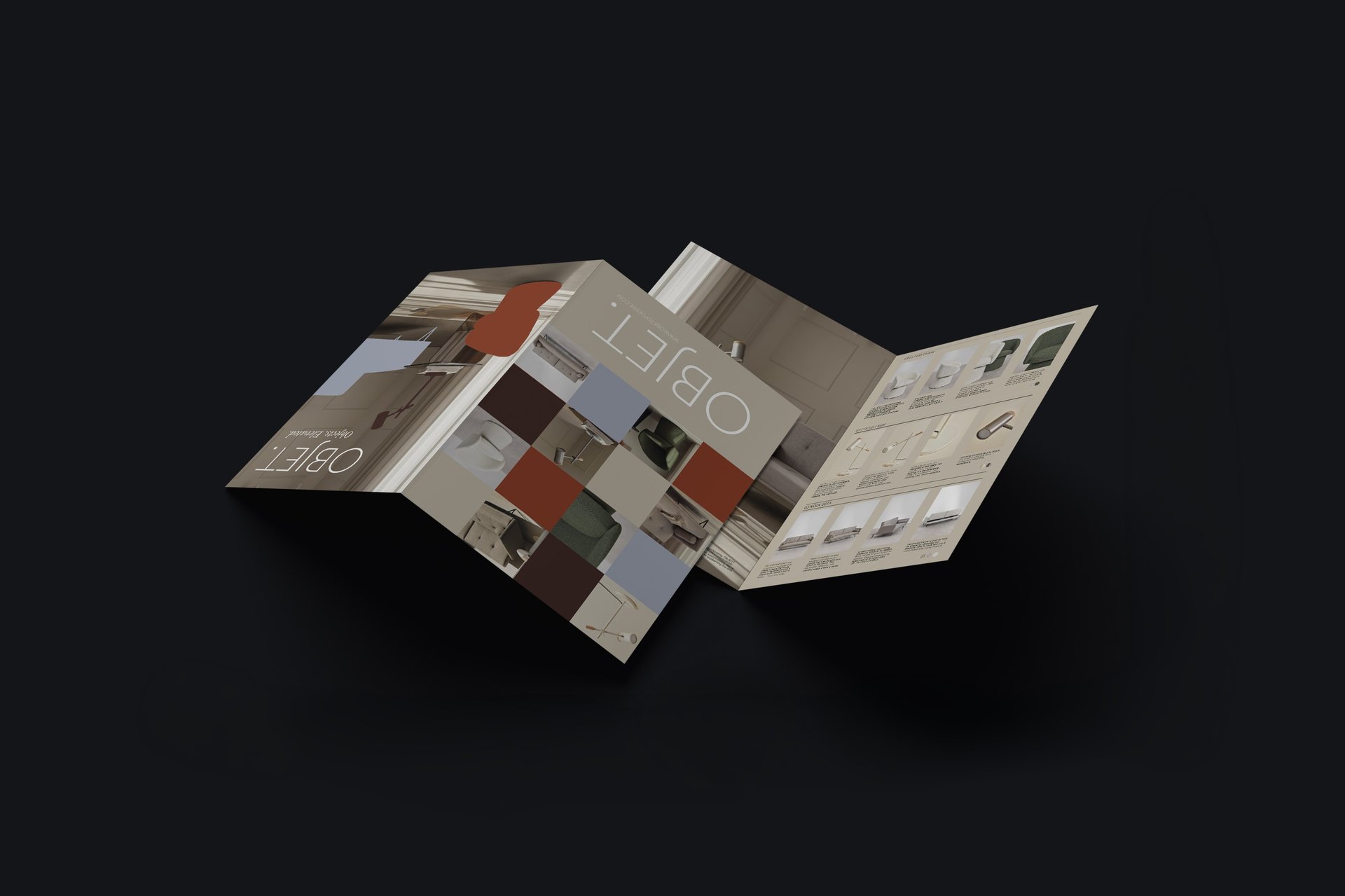
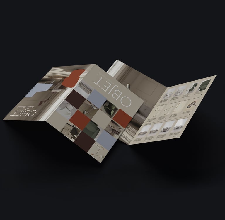
BIFOLD BROCHURE
Product brochure: cover + 2-page spread, 3 SKUs, specs, lifestyle imagery. Print-ready, premium, no AI tells.
Layout: product bleeds across spreads, Geliat + Garamond, beige base with terracotta accents. Generous negative space. The brochure works as sales tool and brand statement. Clean, considered, built to last on a coffee table.
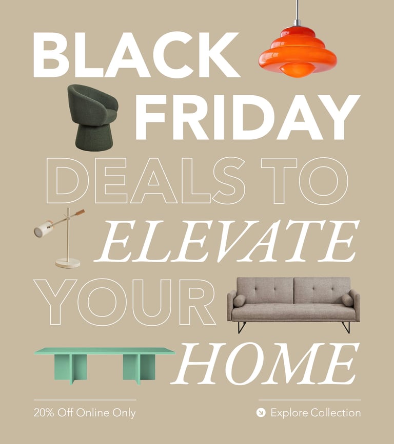
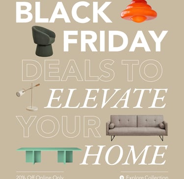
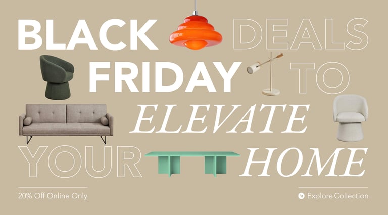
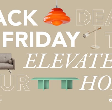

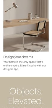
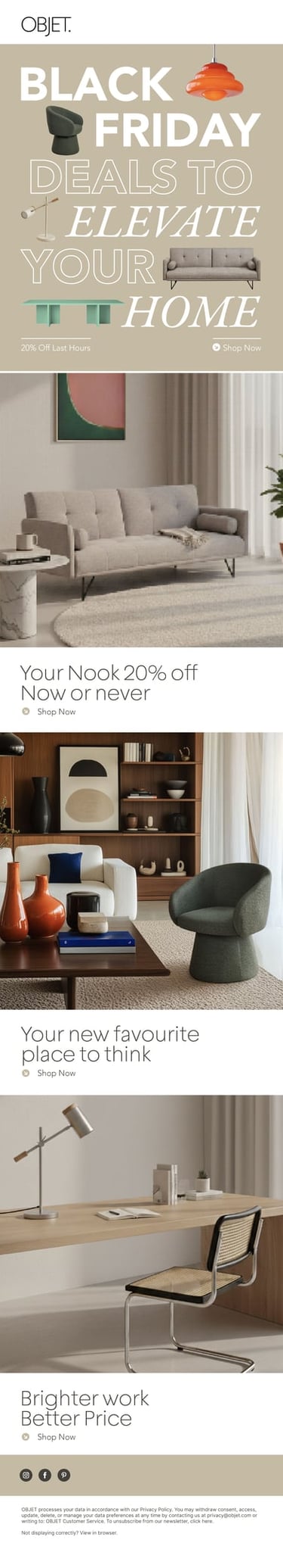
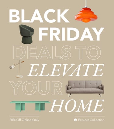
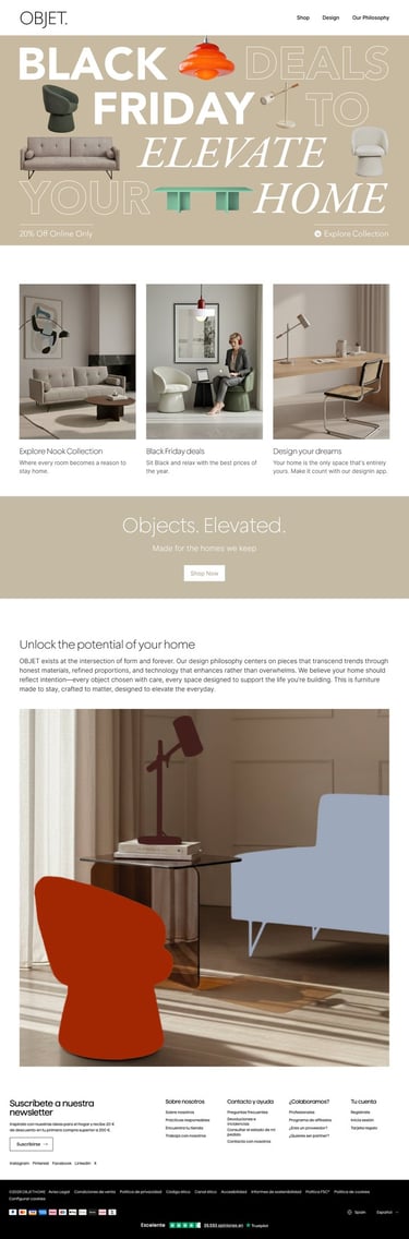
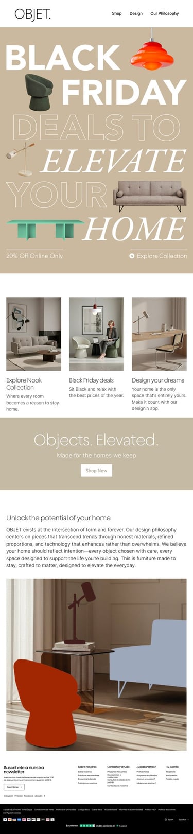
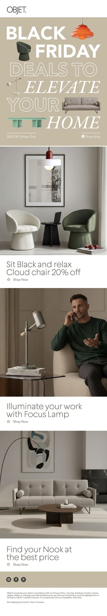
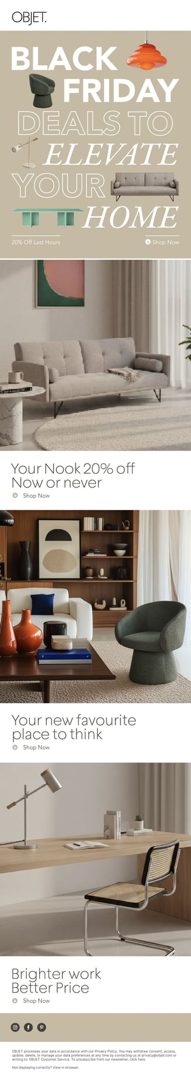
BLACK FRIDAY ASSETS
Landing page, email newsletters and banners. The challenge? Sell without screaming.
The aesthetics were bold typography for urgency, restrained layouts for brand elevation. Product cutouts on beige backgrounds, terracotta accents for warmth. Figma Auto Layout for banners reduced production from hours to minutes.
The campaign had to convert without looking desperate. Premium feel, promotional pricing. OBJET doesn't scream discounts, it whispers opportunity.

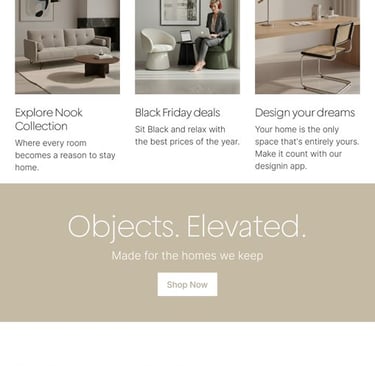

Landing Desktop
Tablet
Mobile
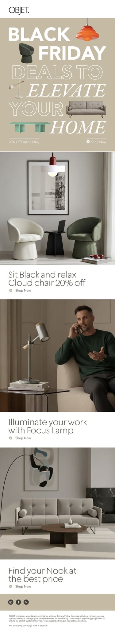
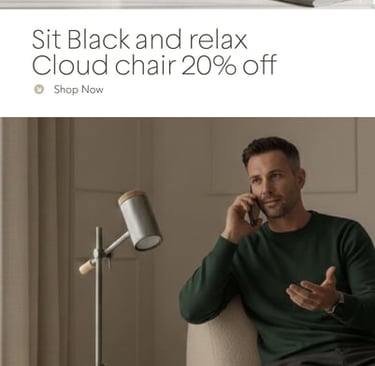
Newsletter #1
Newsletter #2
2.5 days. Multiple touchpoints. Zero photoshoots. Zero crew.
AI handled speed. I handled taste. Hybrid workflow turned studio shots into a full content ecosystem that actually elevated the brand.
OBJET got campaign assets that felt premium, cohesive, and intentional. Startup budget but established brand look. That was the brief and that's what shipped.


WHAT SHIPPED
Translating OBJET's rebrand into real touchpoints: Social content, brand collateral and Black Friday campaign assets. Built in record time using a hybrid AI workflow.
Deliverables: Landing page, digital banners, social posts, brochure, fake UGC content.
Tools: Photoshop, Ideogram, HeyGen, Kling AI, Figma, Nano Banana and Claude.
The approach: AI handled volume and iteration. I handled curation, refinement, and final composition.
03
OBJET
AI POWERED
BRAND
APPLICATIONS
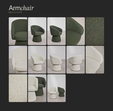
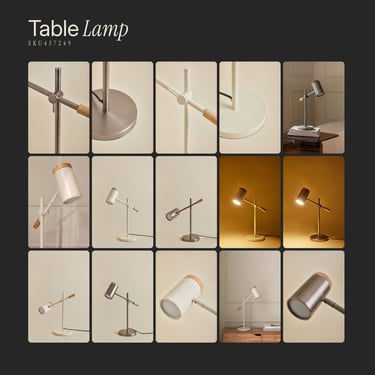
OBJET provided studio shots of 3 SKUs (3-seater sofa, table lamp and an arm Chair). The challenge: place them in realistic lifestyle contexts that felt premium, not generic AI.
The problem is that most AI tools generate product + background together, visually coherent but spatially inconsistent. You can't get the same living room from three angles for different products.
PRODUCT IMAGERY
Solution: Ideogram generated base scenes (empty interiors). Photoshop inserted products with precision. One aesthetic template, multiple SKUs. Visual consistency without chaos.
REFINED SMART BIOPHILIA
Before generating images, I defined art direction grounded in target insights and competitive gaps. A visual language that signals sophistication, modern life and sustainability.
-Tech devices: Target's tech interest + normalizes where people actually work and live.
-Plants: Sustainability, quiet presence.
-Natural materials: Validates quality (light wood, veined stone).
-Soft natural light: Afternoon warmth, long shadows.
-Cultural signals: Design books, minimal ceramics, taste indicators.
Product shots provided:
References:
Generations:
SOCIAL MEDIA CONTENT
IG Feed with generated content:
Social media is where brand systems get stress-tested. This feed was built using AI generated imagery, but the real work was editorial: deciding what fits, what doesn't, and why. Consistent enough to feel like a brand. Varied enough to not feel like a template. Somewhere, a production team of twelve is very confused about where their jobs went.


Tablet
Mobile
Newsletters
2.5 days. Multiple touchpoints. Zero photoshoots. Zero crew.
AI handled speed. I handled taste. Hybrid workflow turned studio shots into a full content ecosystem that actually elevated the brand.
OBJET got campaign assets that felt premium, cohesive, and intentional. Startup budget but established brand look. That was the brief and that's what shipped.
WHAT SHIPPED
BIFOLD BROCHURE
Product brochure: cover + 2-page spread, 3 SKUs, specs, lifestyle imagery. Print-ready, premium, no AI tells.
Layout: product bleeds across spreads, Geliat + Garamond, beige base with terracotta accents. Generous negative space. The brochure works as sales tool and brand statement. Clean, considered, built to last on a coffee table.
BLACK FRIDAY ASSETS
Landing page, email newsletters and banners. The challenge? Sell without screaming.
The aesthetics were bold typography for urgency, restrained layouts for brand elevation. Product cutouts on beige backgrounds, terracotta accents for warmth. Figma Auto Layout for banners reduced production from hours to minutes.
The campaign had to convert without looking desperate. Premium feel, promotional pricing. OBJET doesn't scream discounts, it whispers opportunity.
Landing Desktop