MAKING BRANDS LOOK COOL




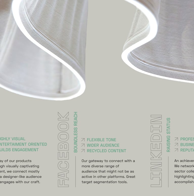
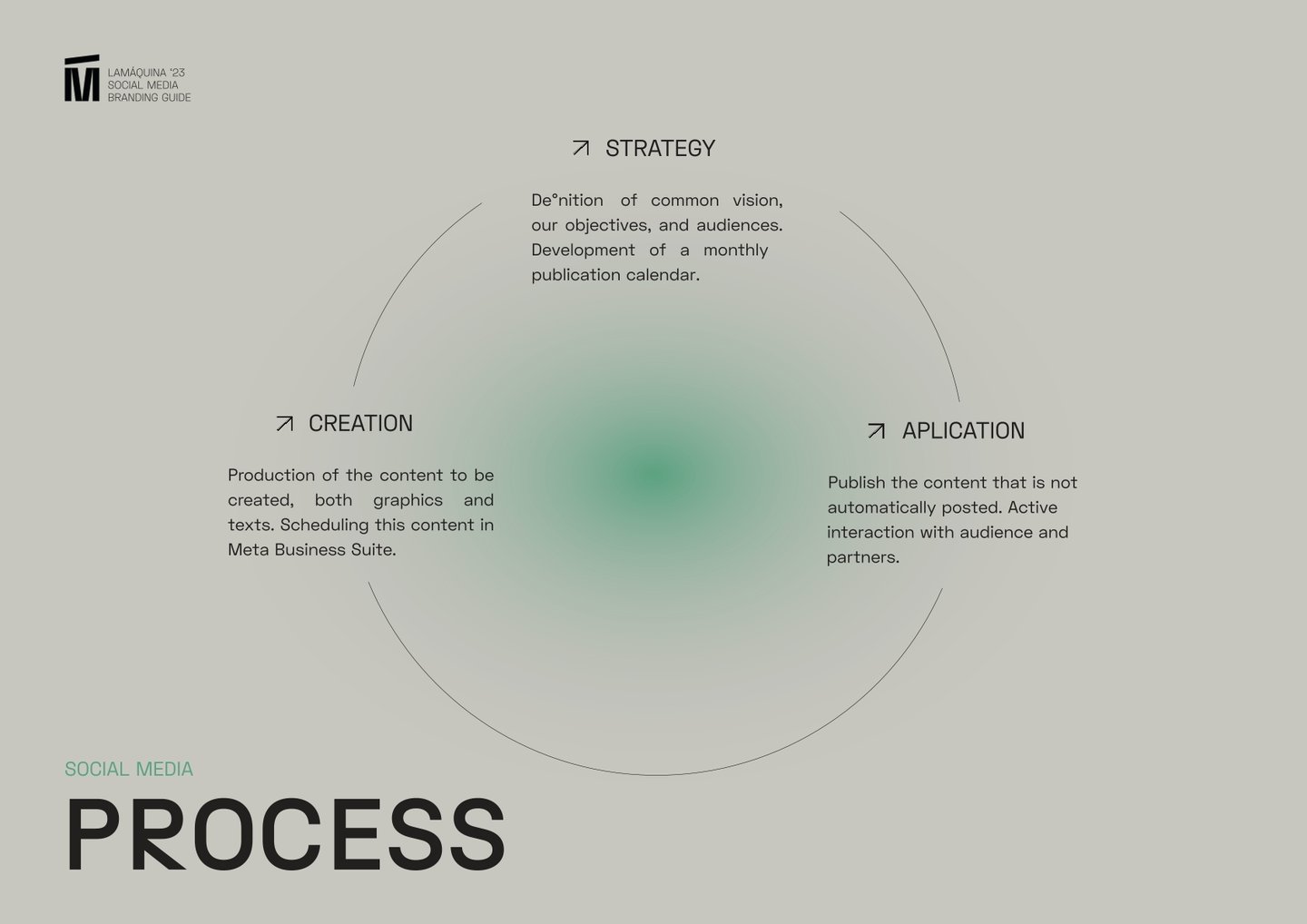
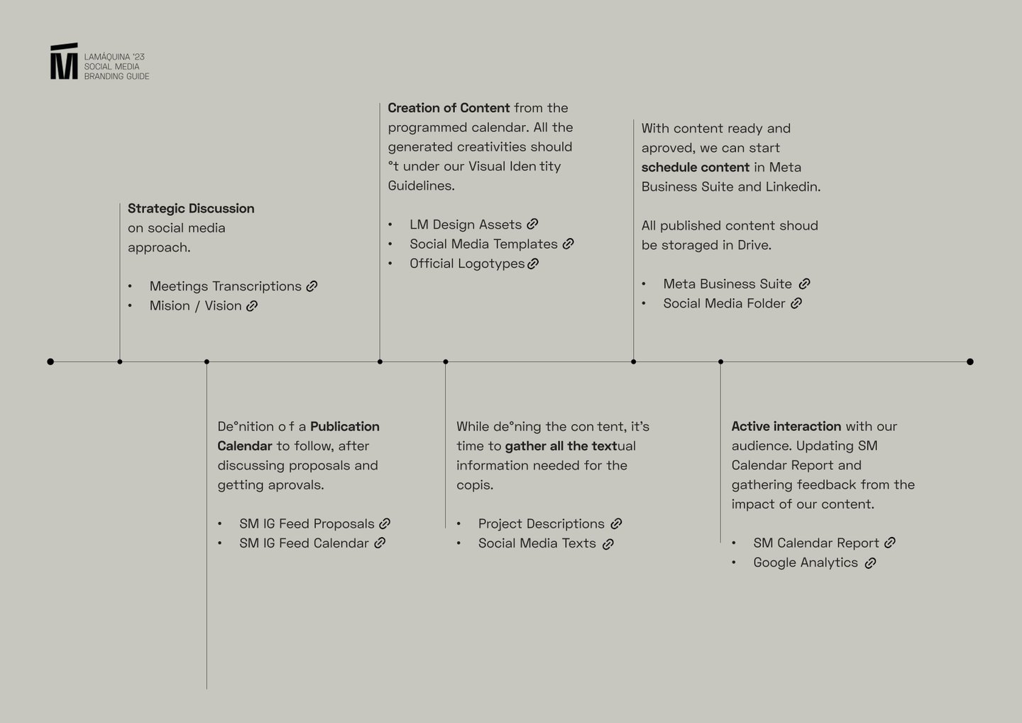
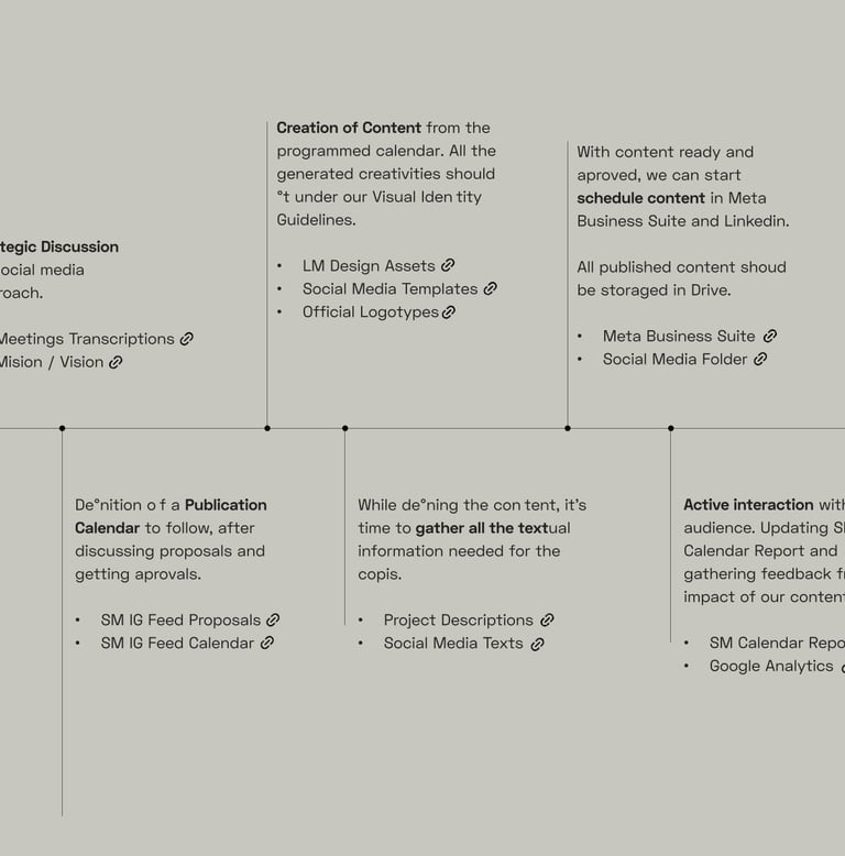
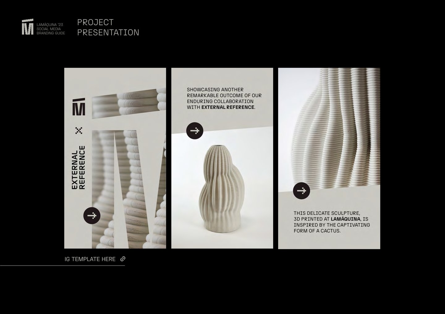
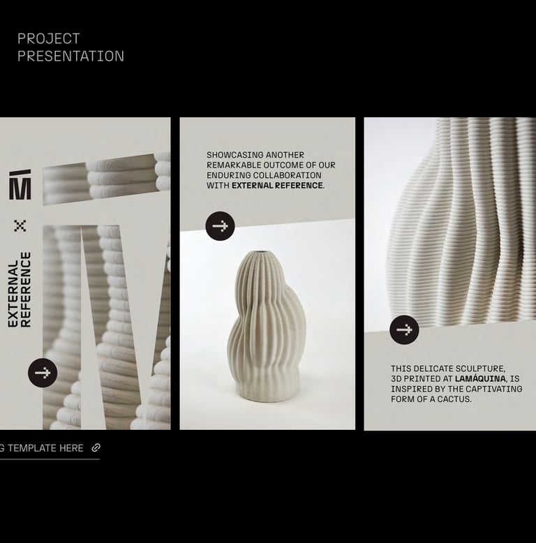
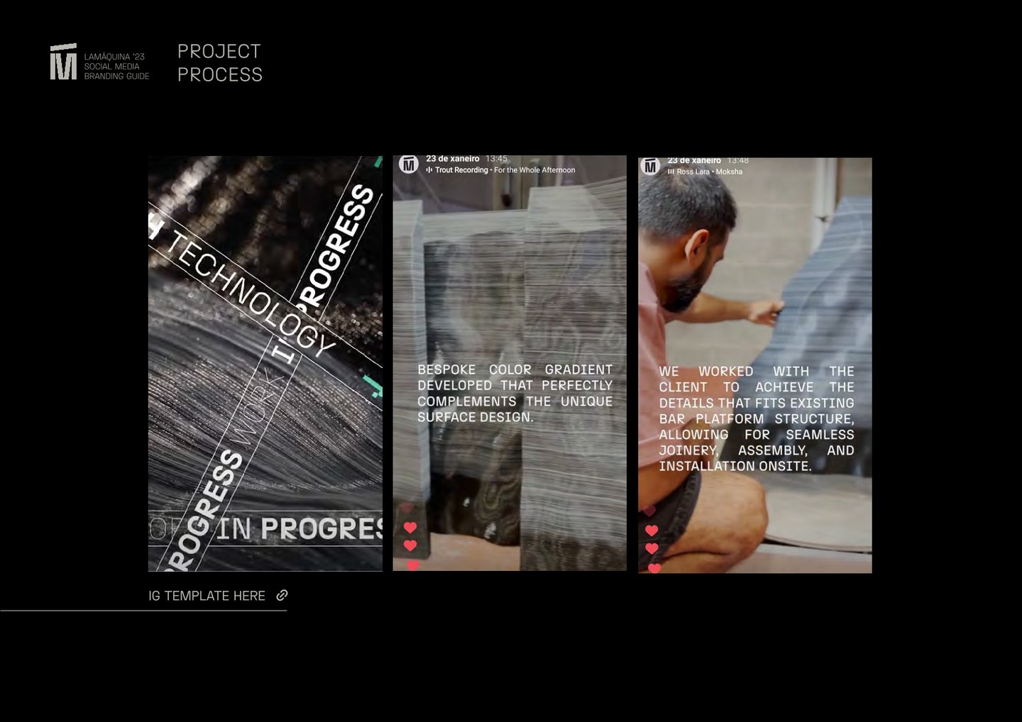
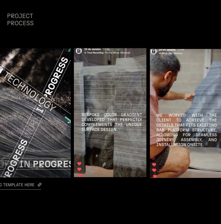
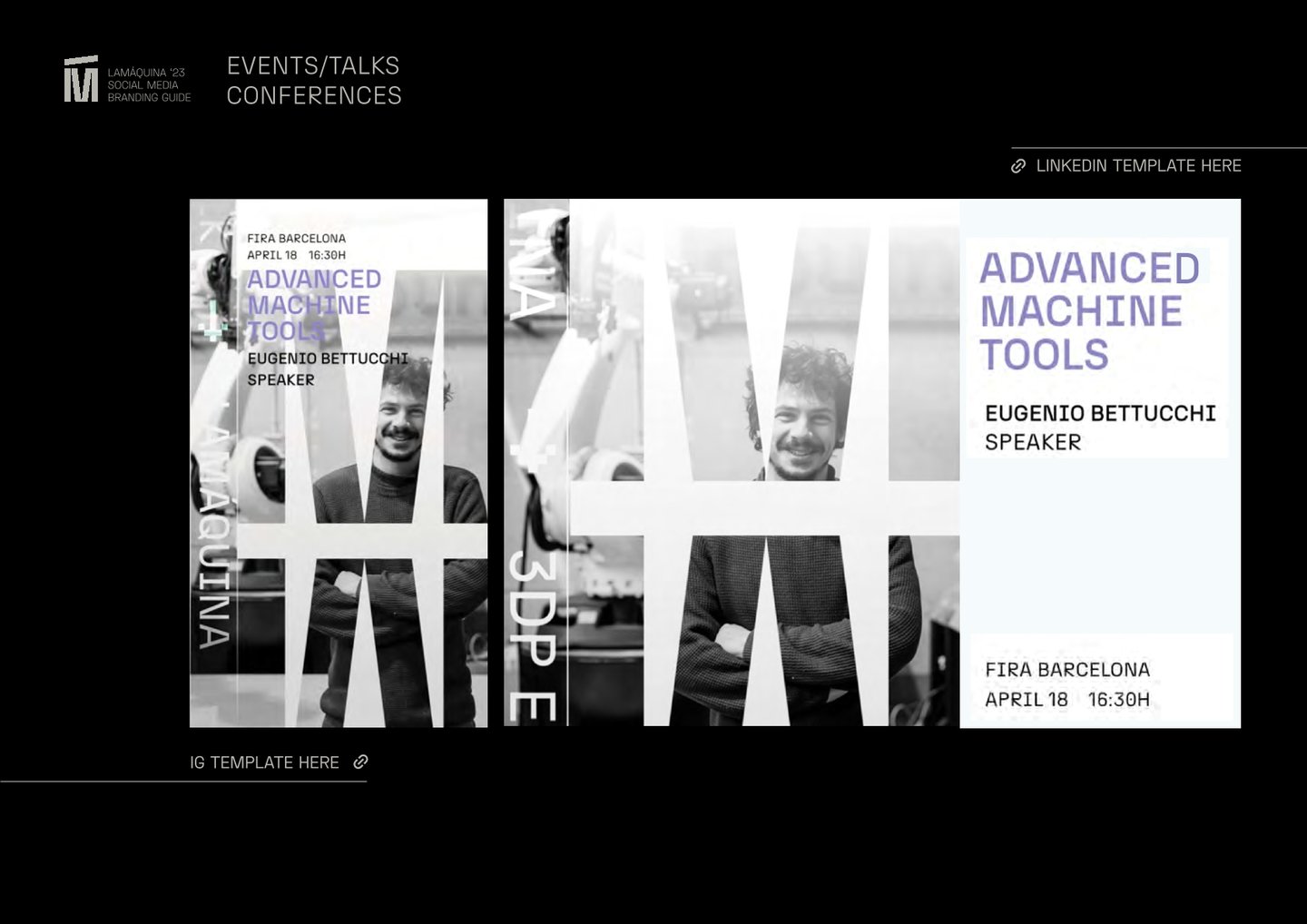
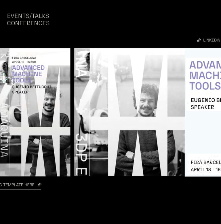
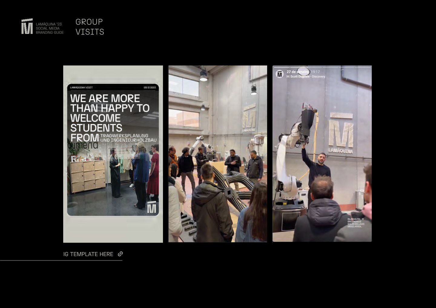
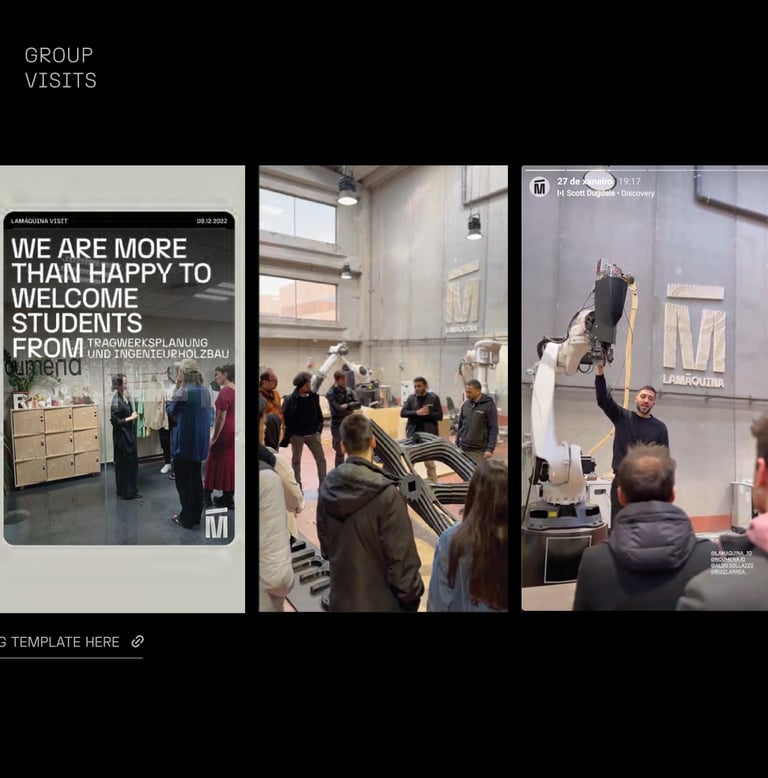
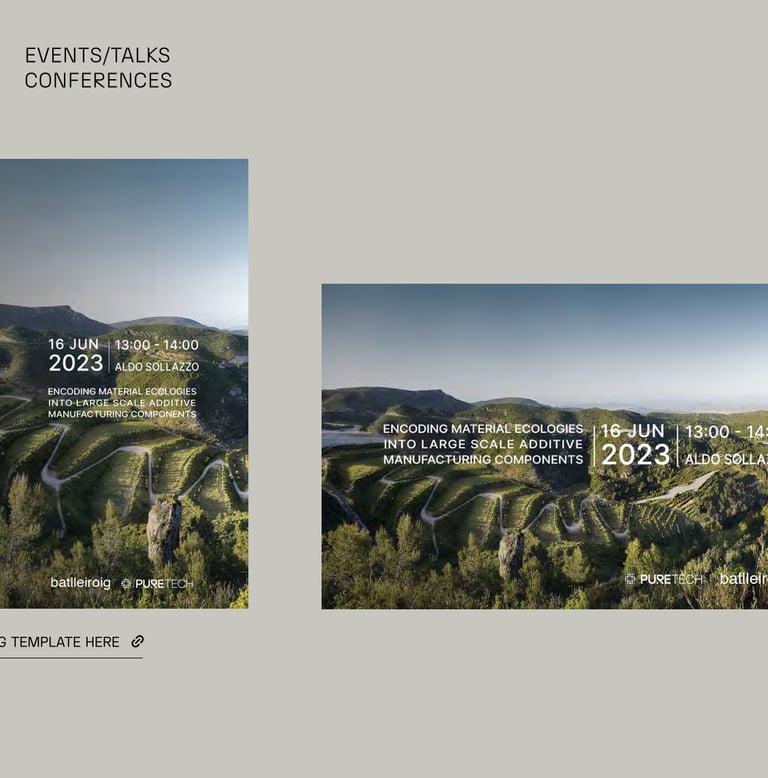
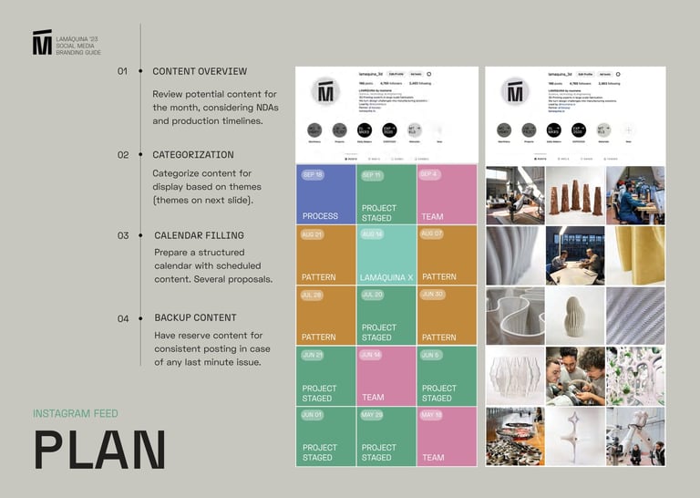
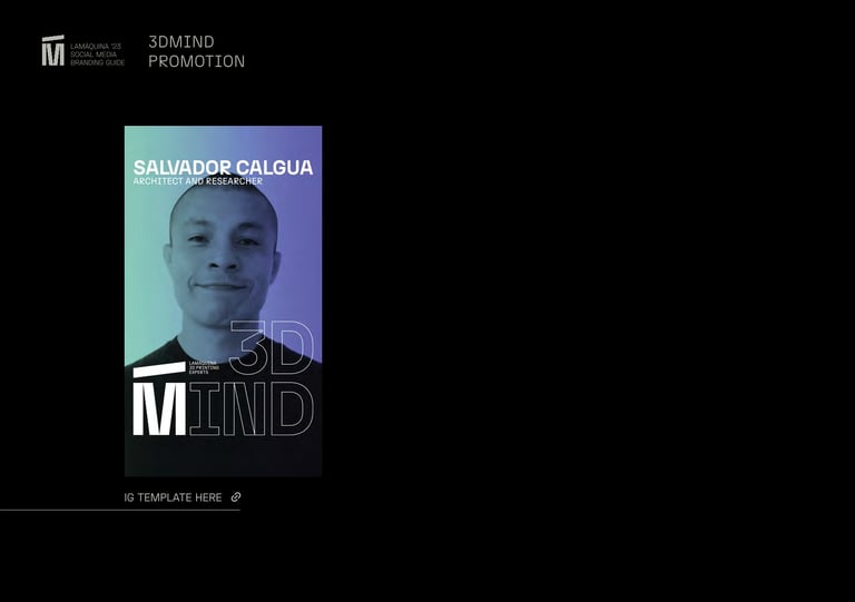
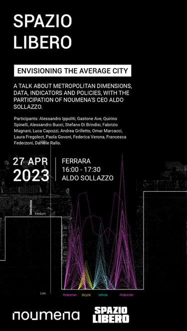
The manual has been carefully designed to ensure quick and effortless access to its contents, thanks to direct links to templates and additional files essential for social media management.
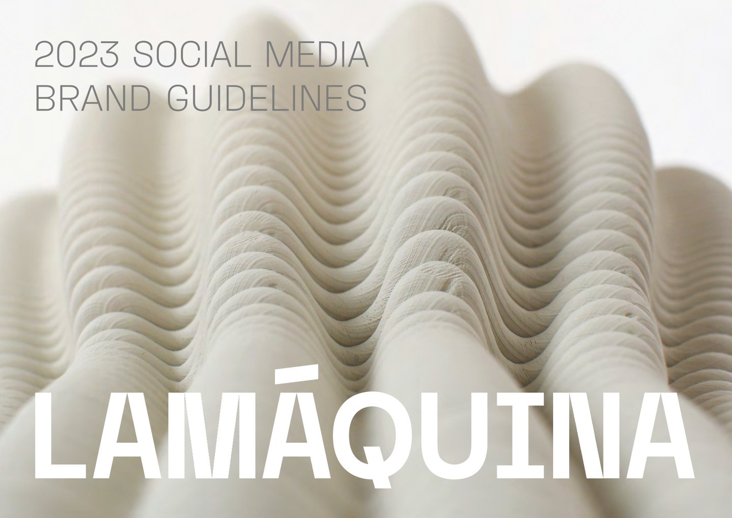
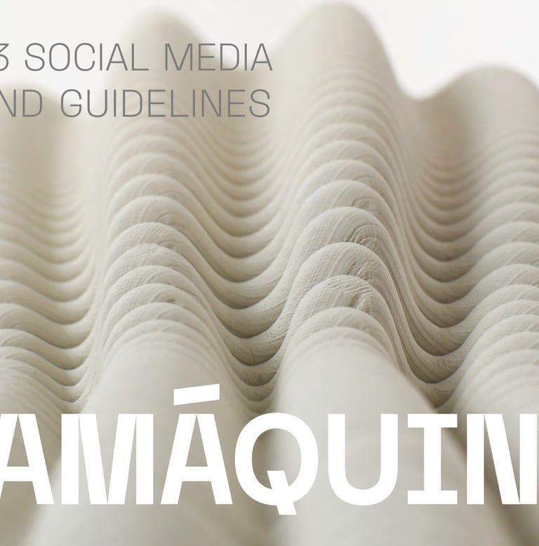
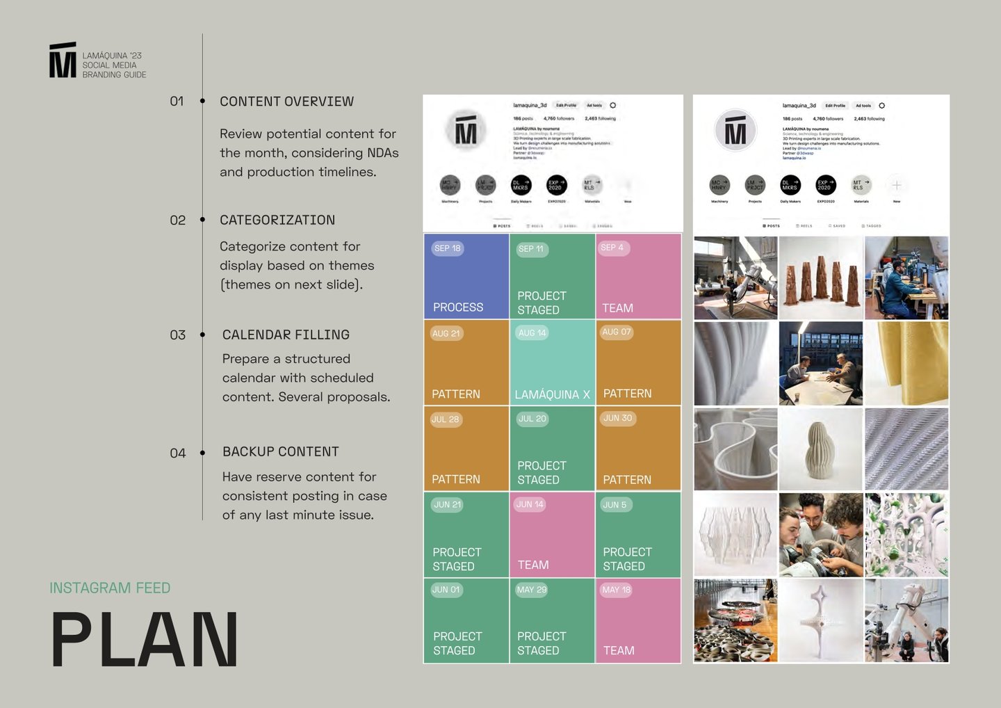
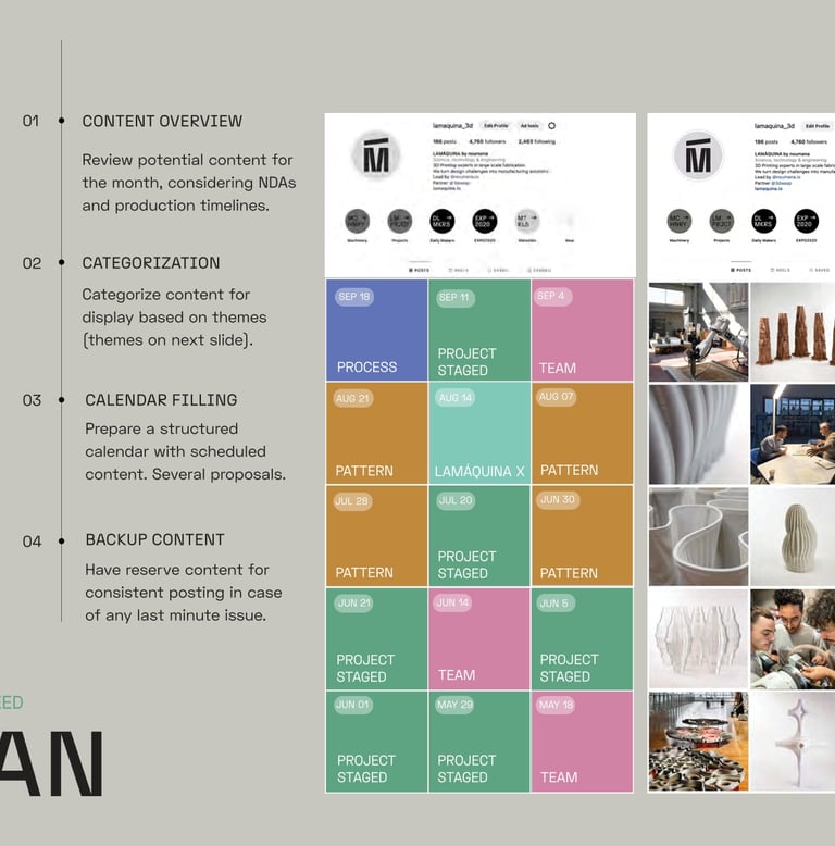
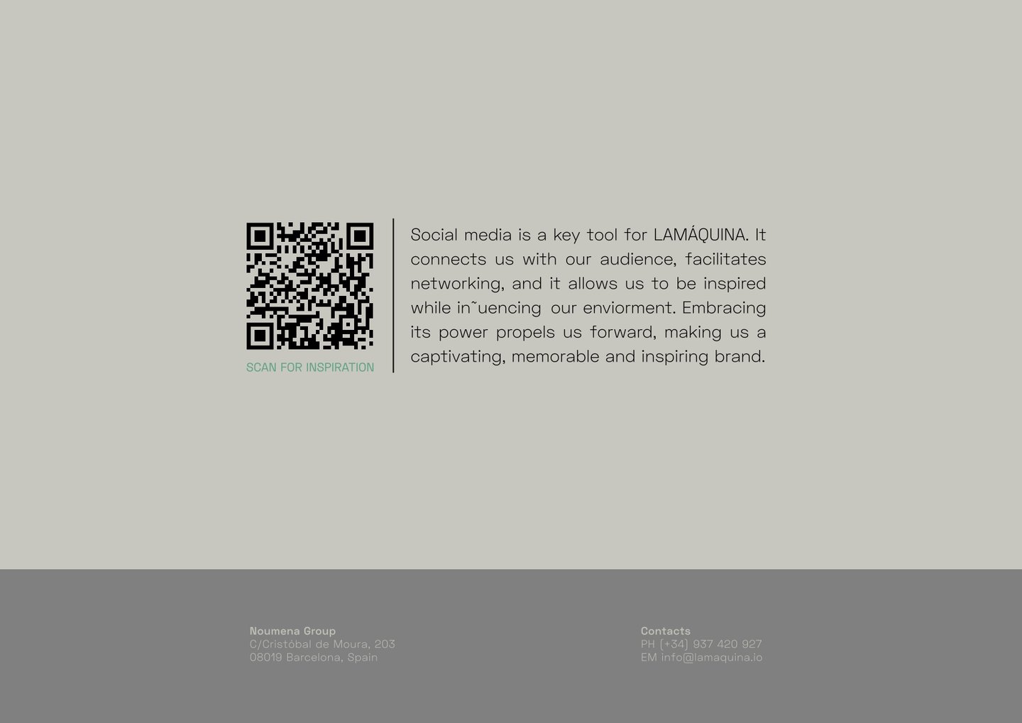
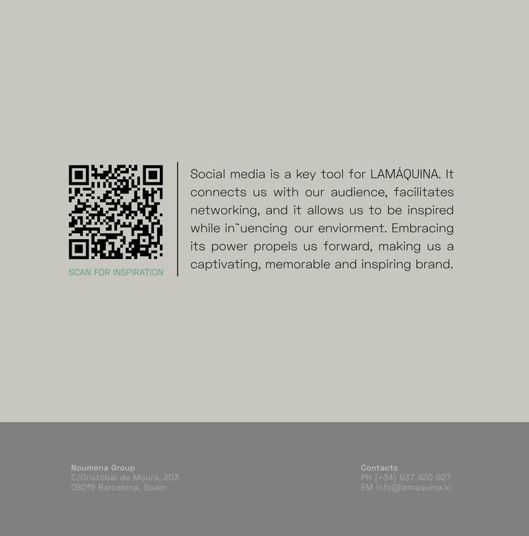
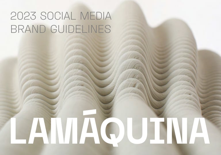
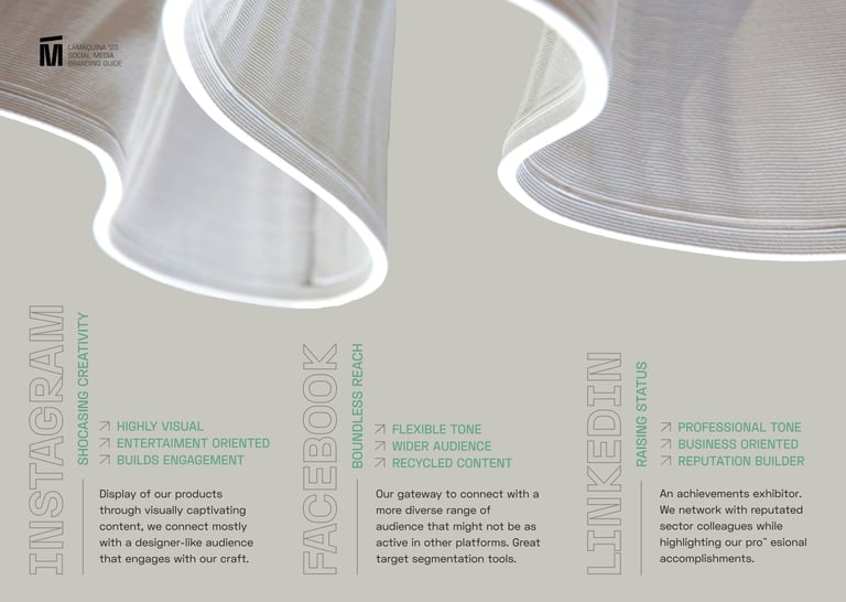
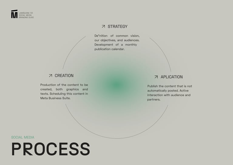
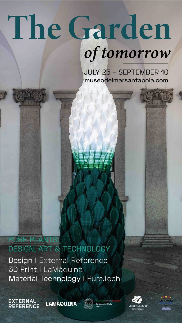
This social media manual aimed to ensure consistency in our visual identity across various online platforms and promote brand awareness. It covers everything from content planning aligned with marketing requirements, graphic guidelines, optimal publication times, tone in copywriting, other essential elements for effective online presence.
LA MÁQUINA SM BRAND GUIDELINES (2023)
01
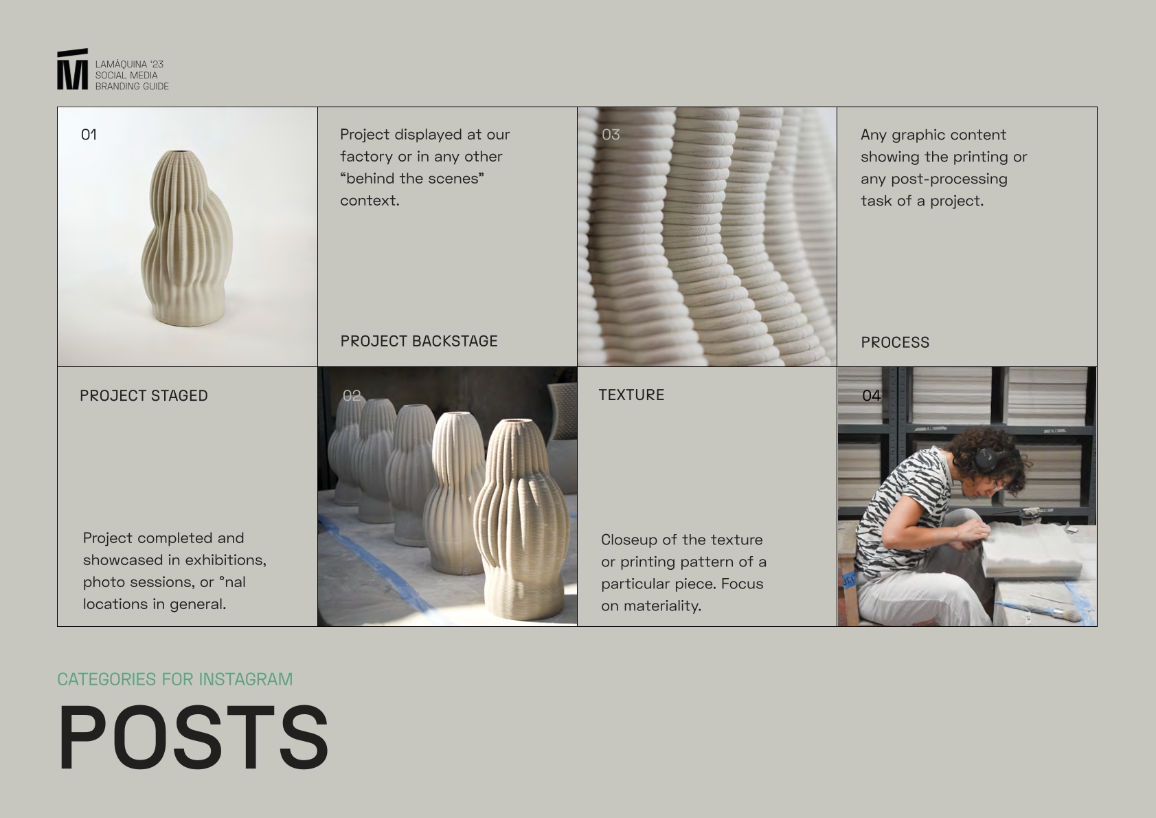
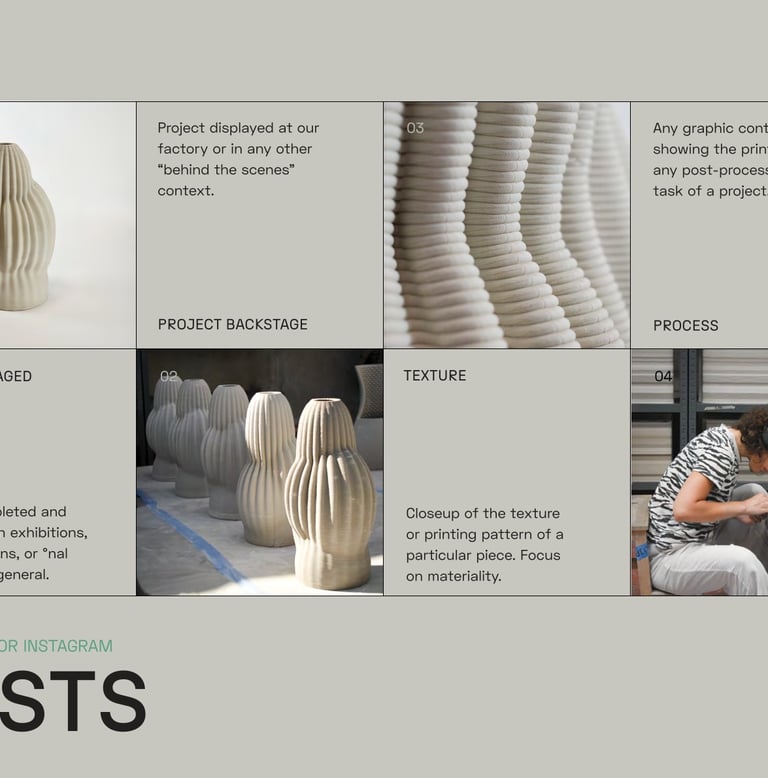


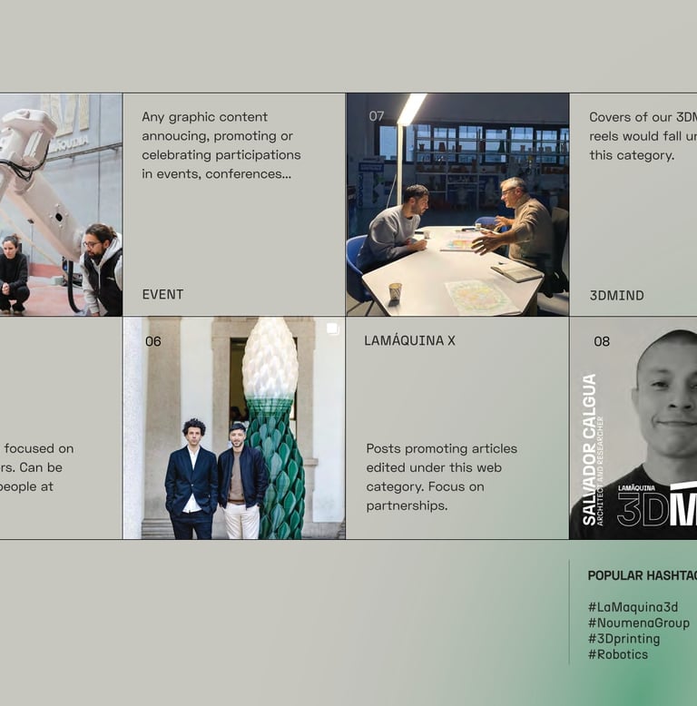
CONTENT CATEGORIES
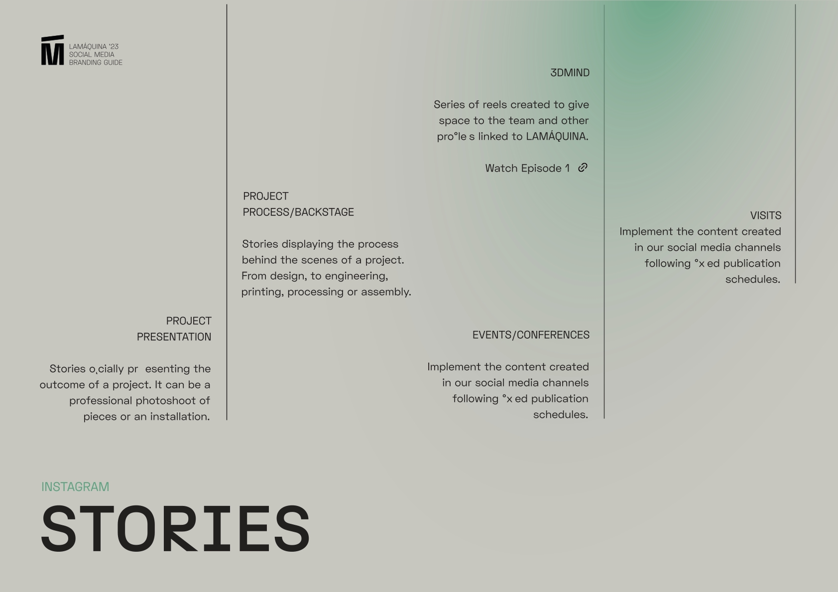
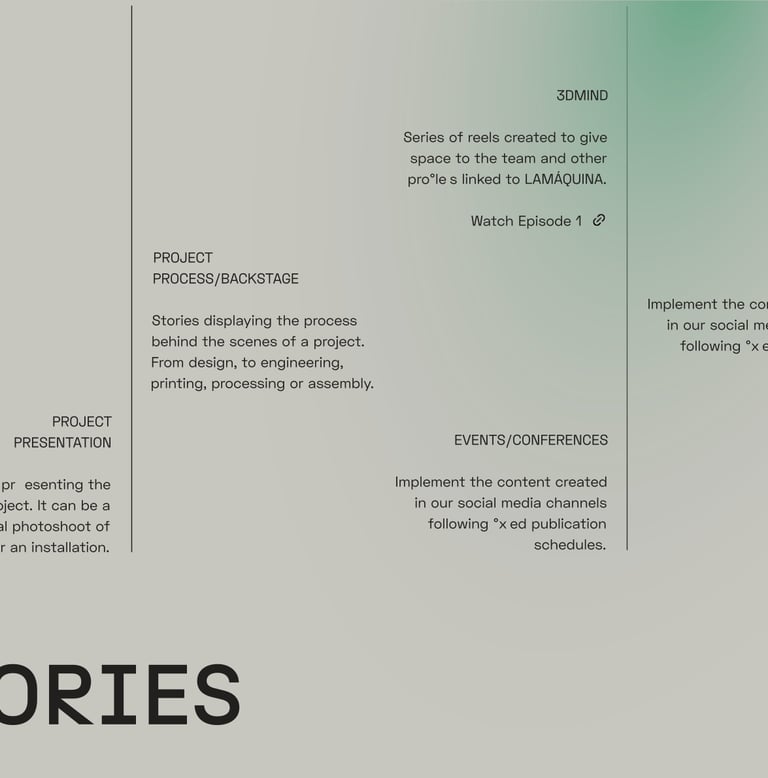


USER FRIENDLY
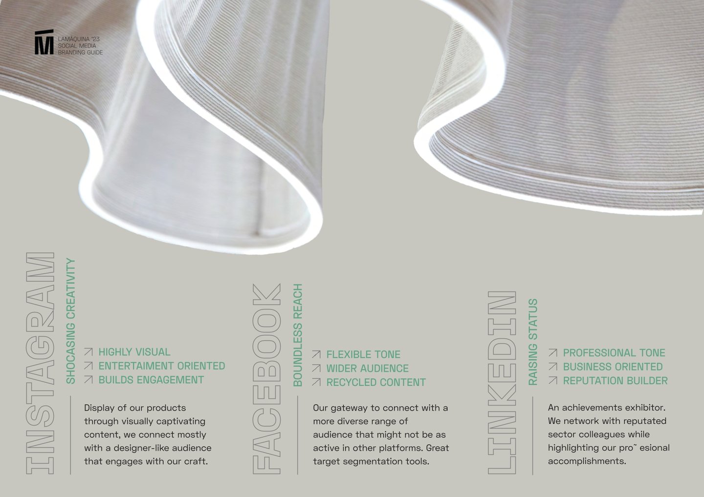
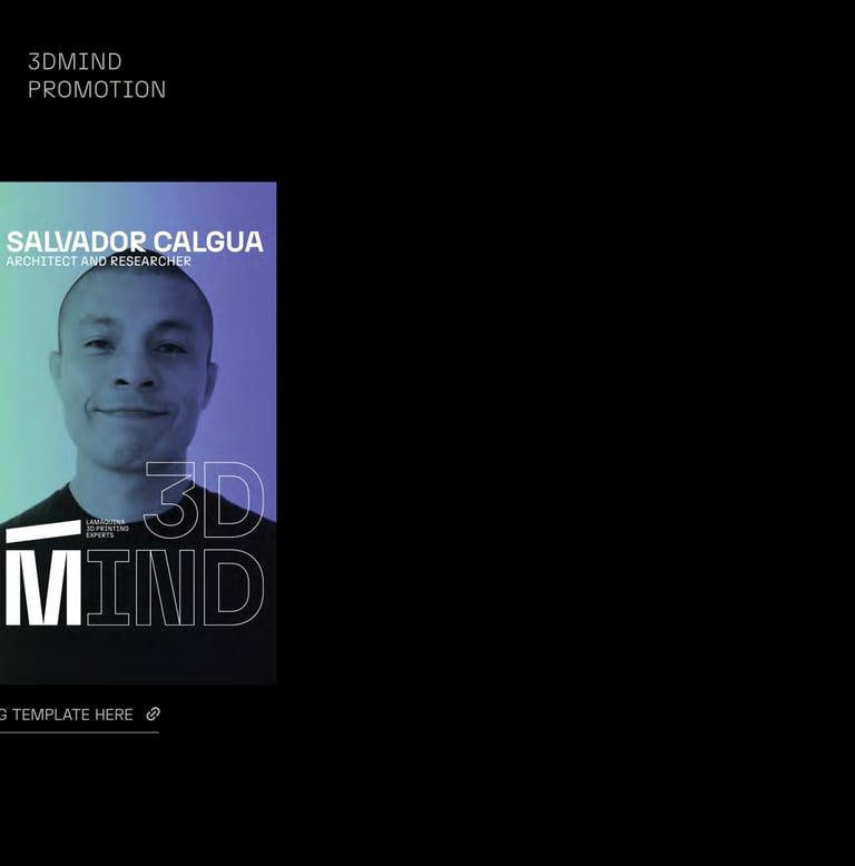
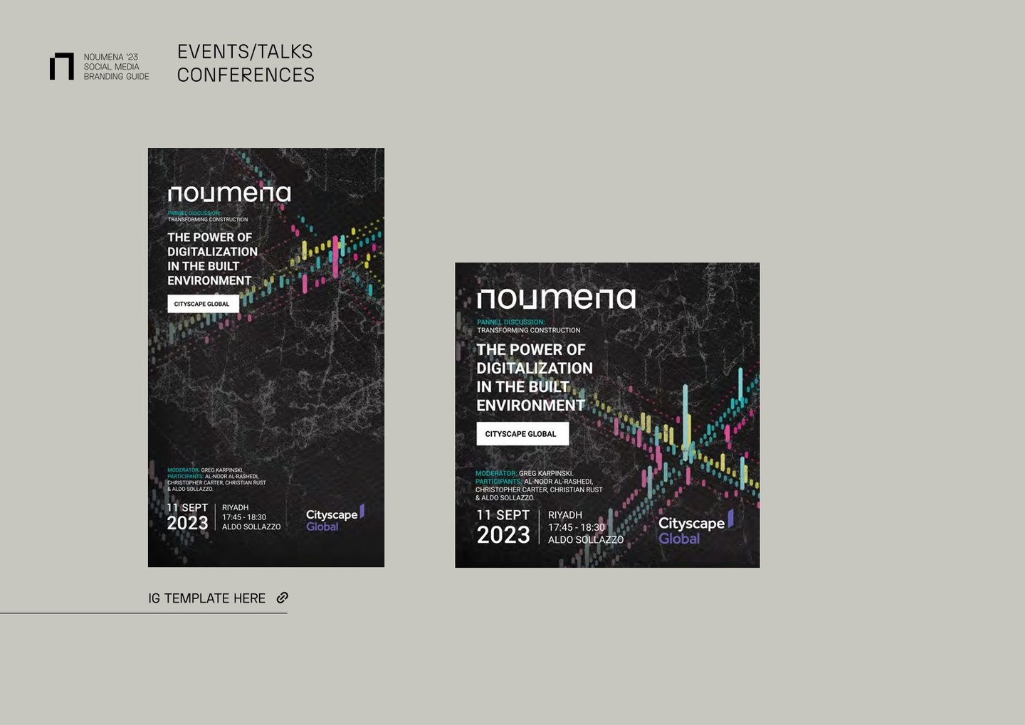
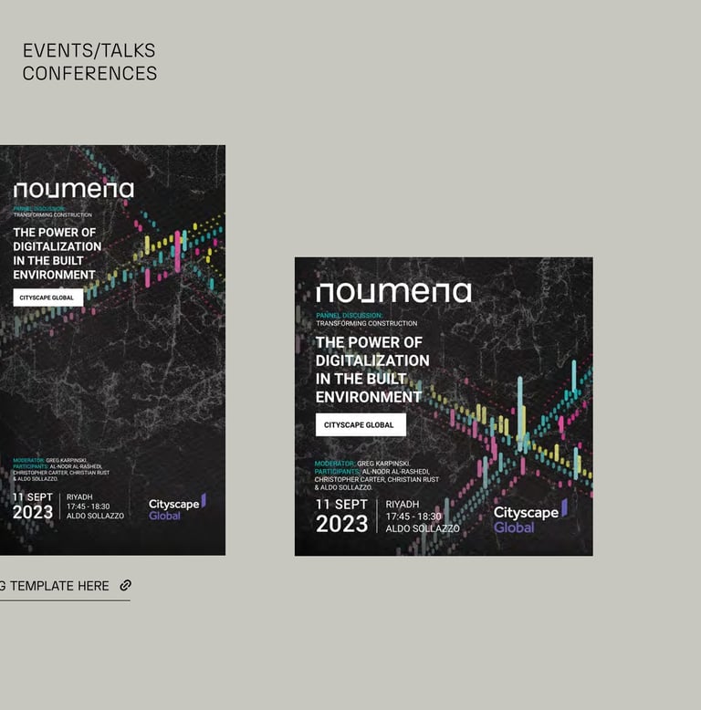
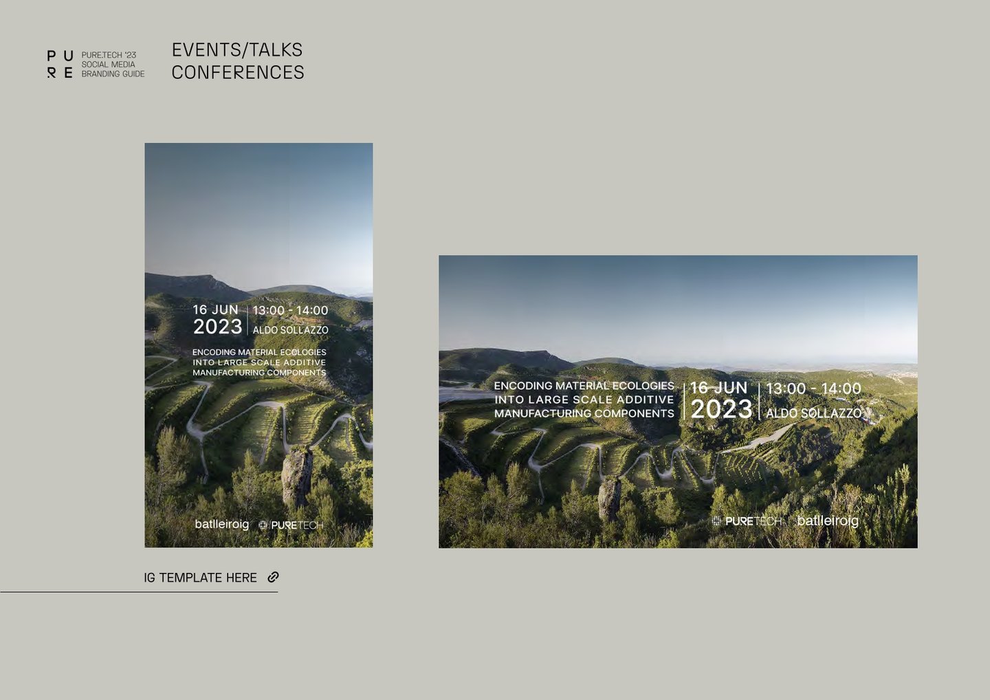
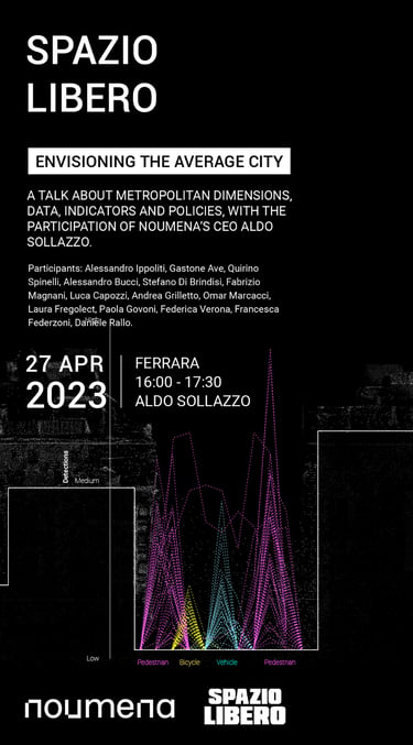
Different content types have been thoughtfully defined in accordance with marketing guidelines, ensuring alignment with sales objectives.

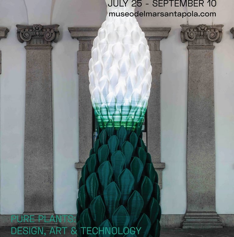

























LA MÁQUINA
SM BRAND
GUIDELINES (2023)
01
This social media manual aimed to ensure consistency in our visual identity across various online platforms and promote brand awareness. It covers everything from content planning aligned with marketing requirements, graphic guidelines, optimal publication times, tone in copywriting, other essential elements for effective online presence.
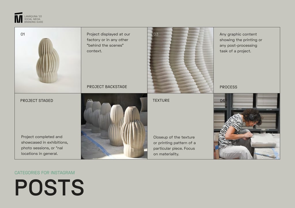
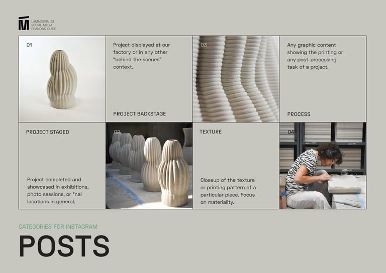
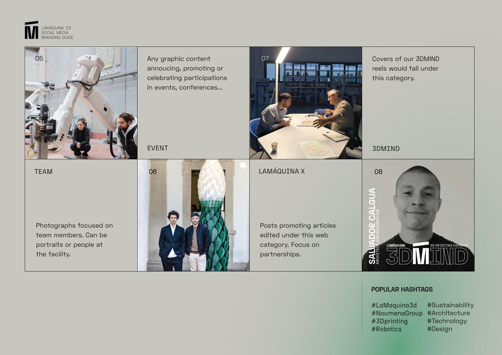


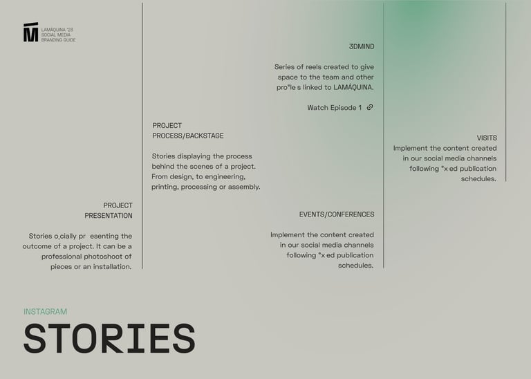


Different content types have been thoughtfully defined in accordance with marketing guidelines, ensuring alignment with sales objectives.
The manual has been carefully designed to ensure quick and effortless access to its contents, thanks to direct links to templates and additional files essential for social media management.





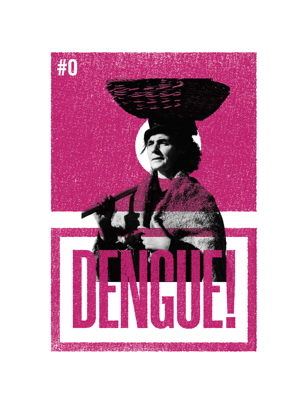

BRANDBOOK
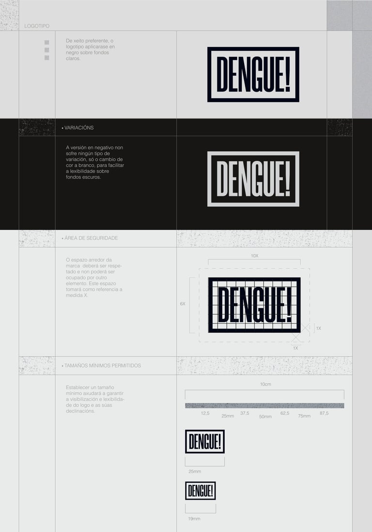
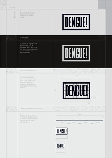
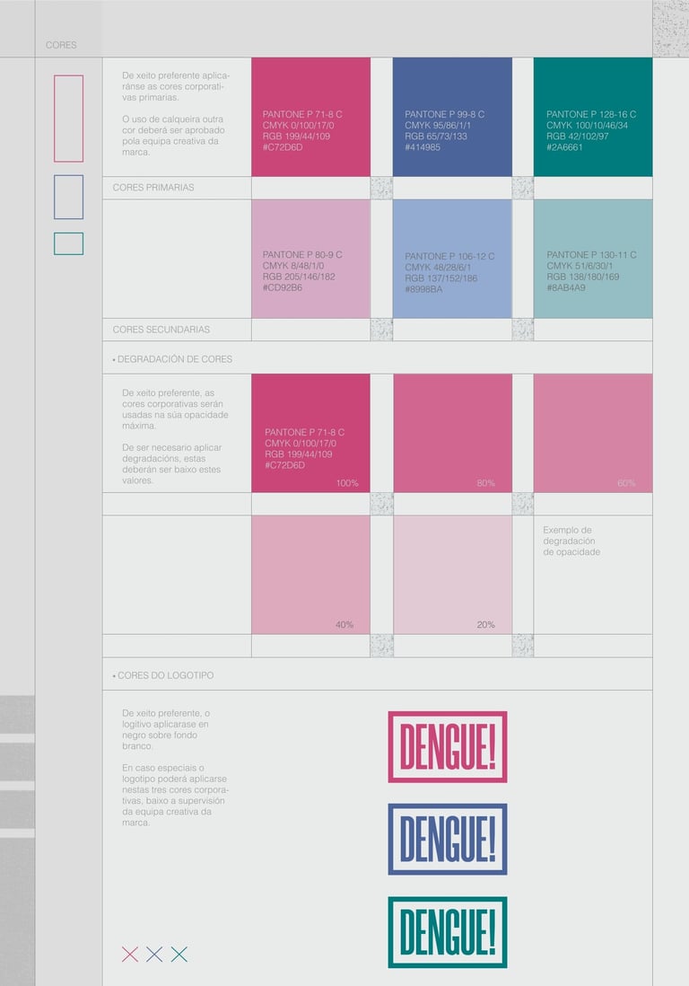
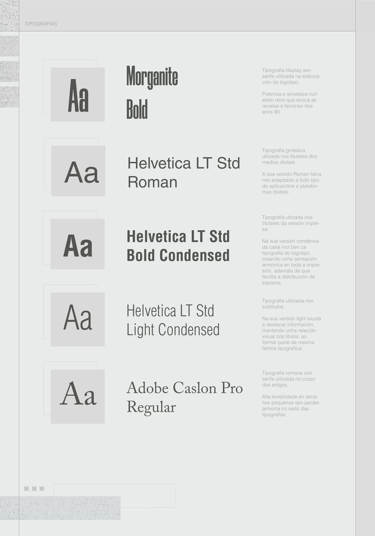
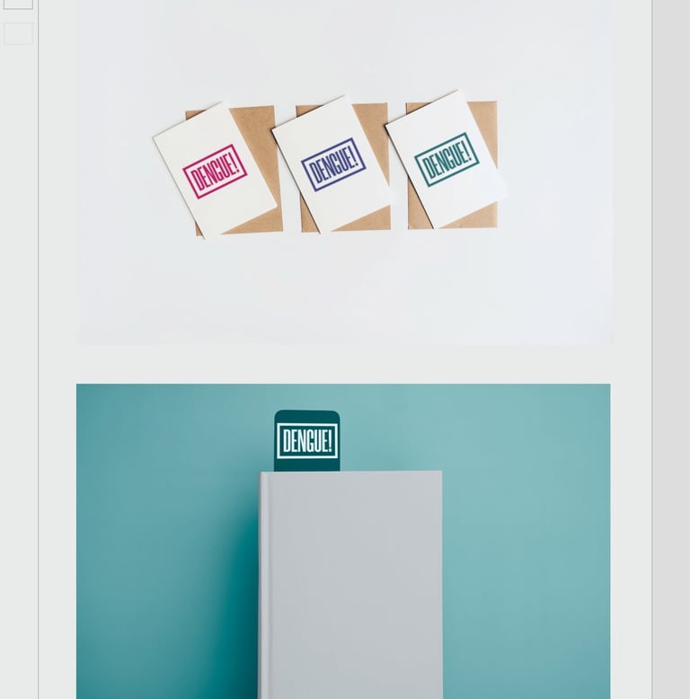
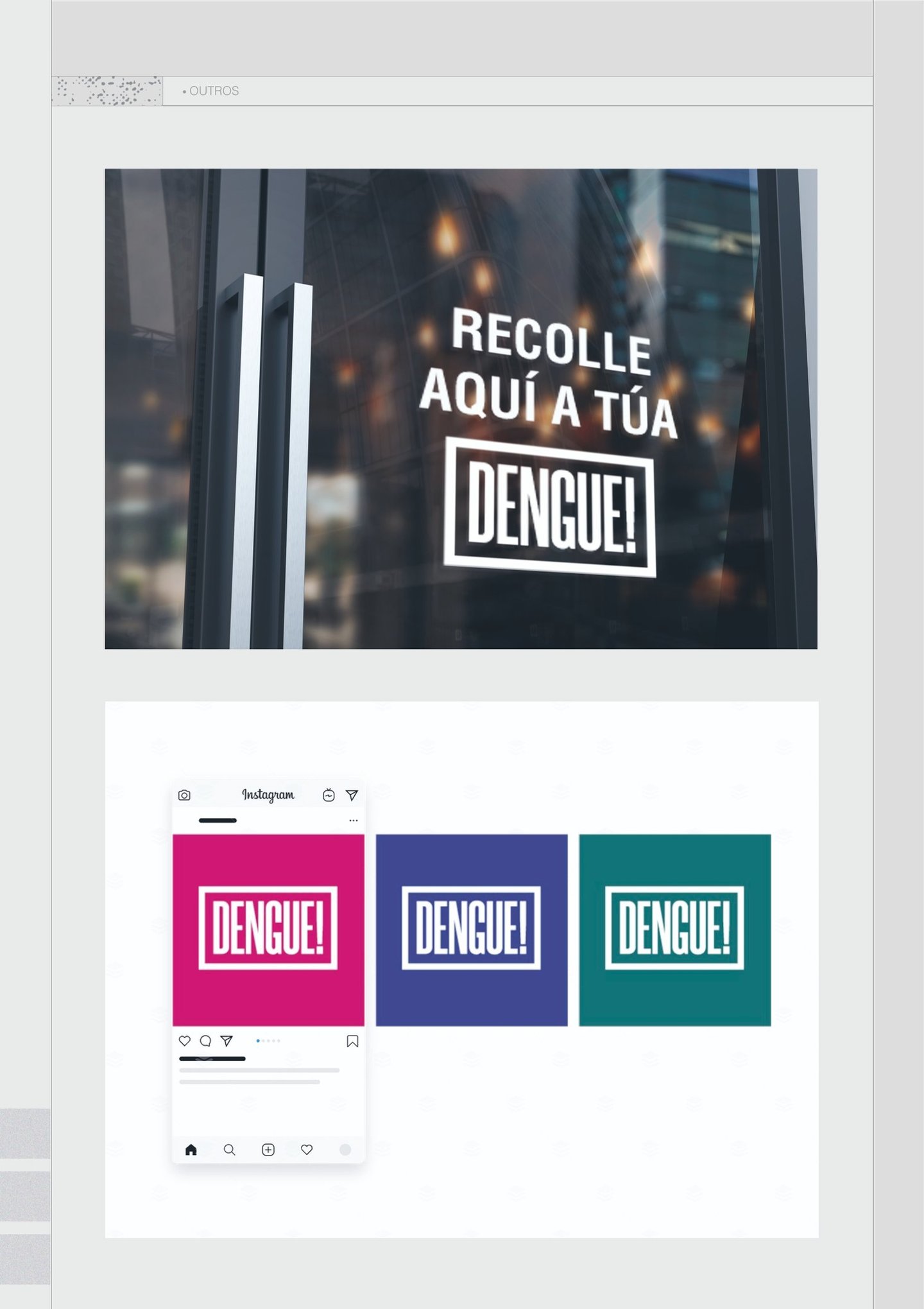
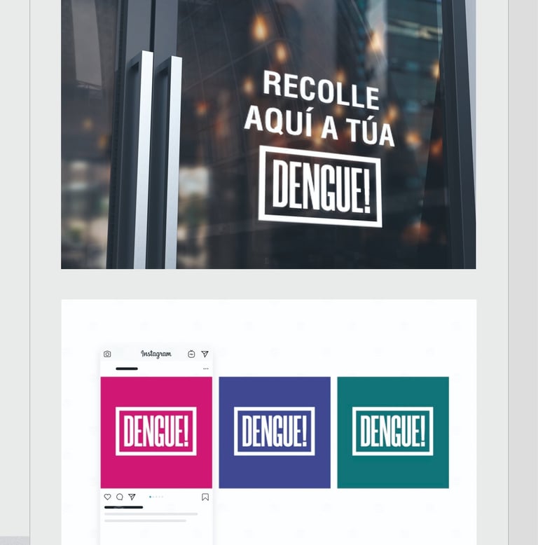
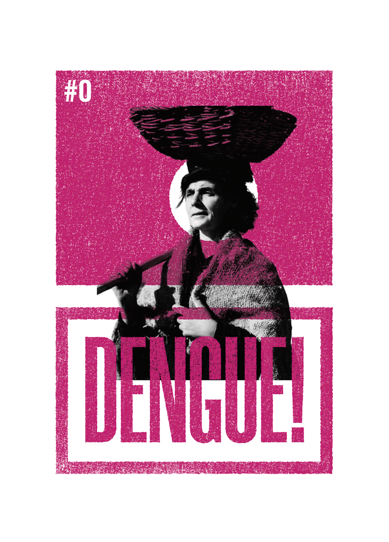
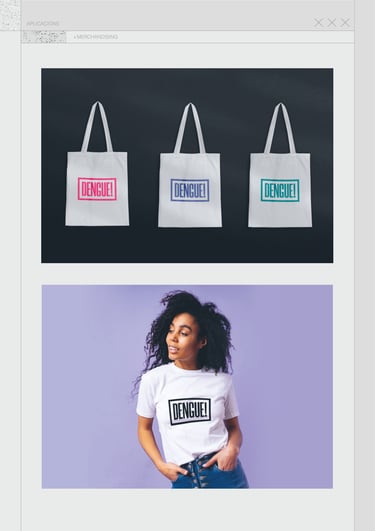
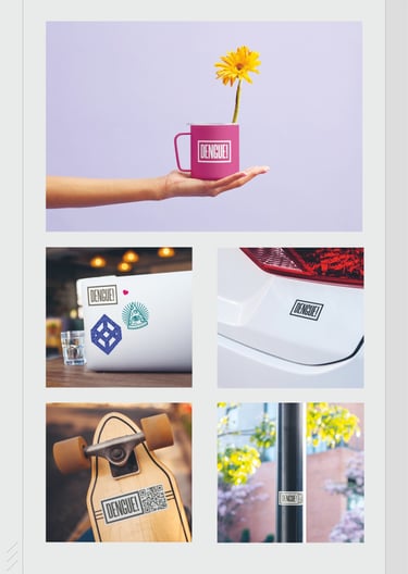
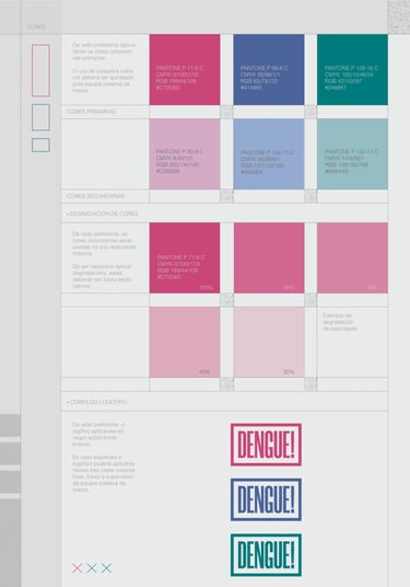
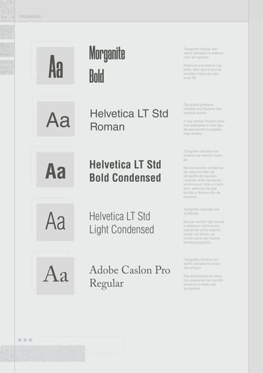
A comprehensive guide to the visual identity, tone, and messaging that define the spirit of Dengue. Here, you'll find the essential elements that shape the brand, from logo usage and color palette to typography and imagery guidelines. By adhering to these standards, we ensure consistency and coherence between our digital and printed platforms.
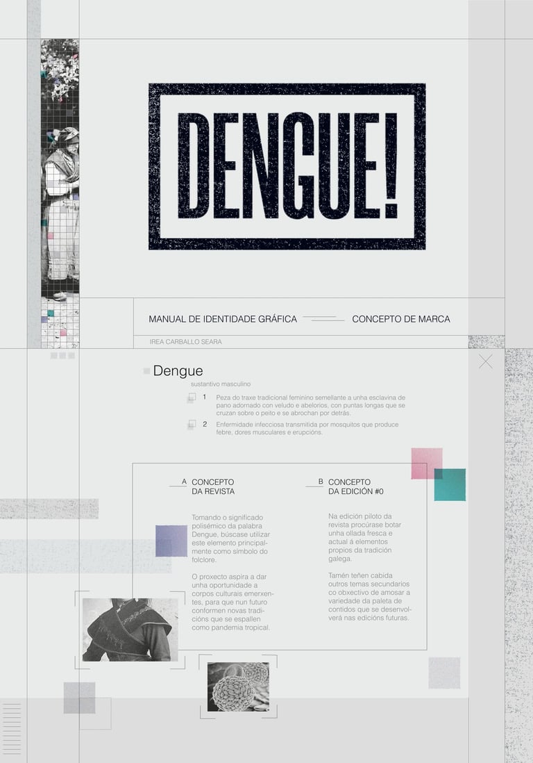
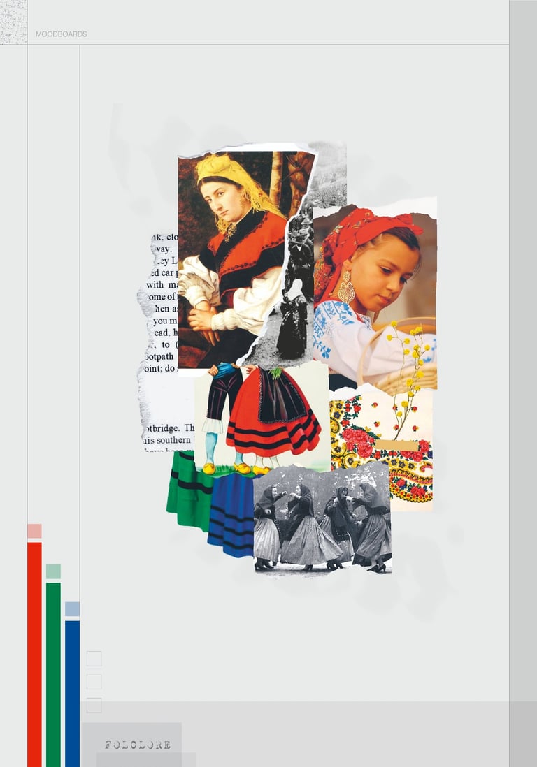
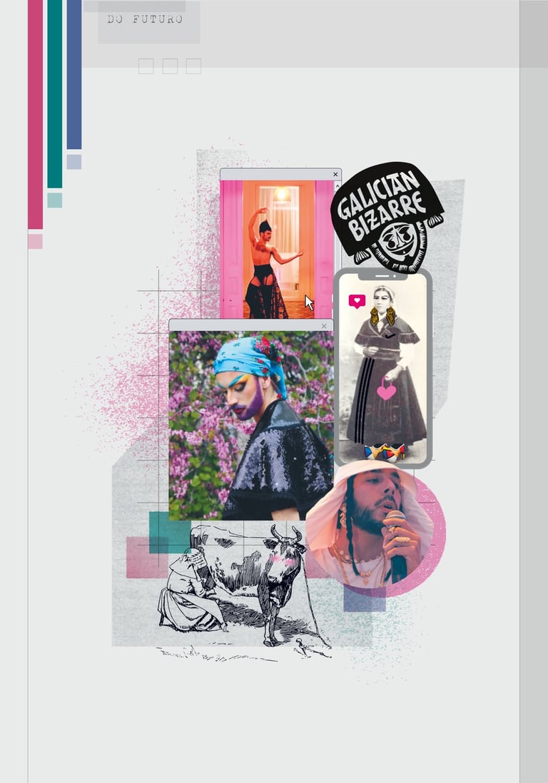
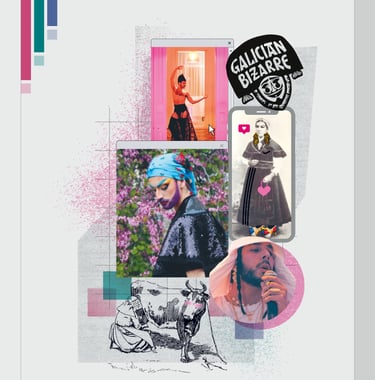
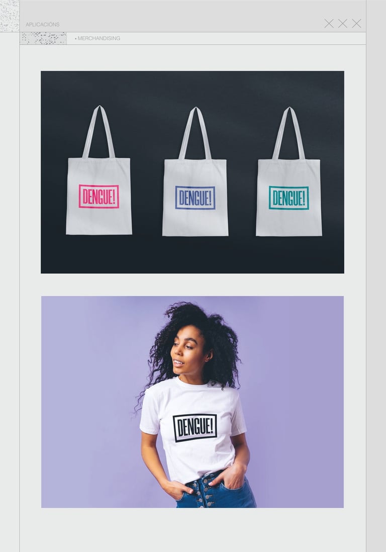
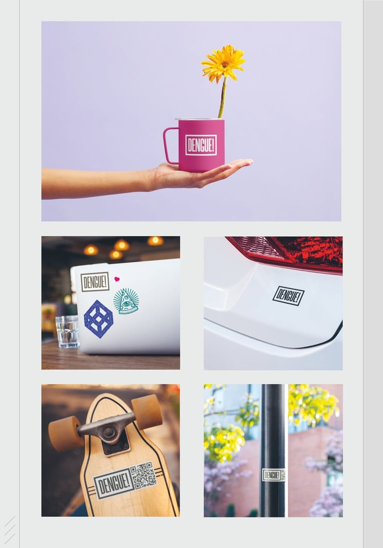
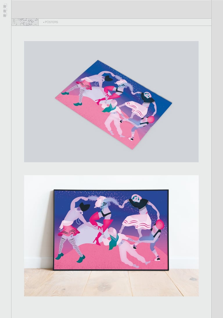
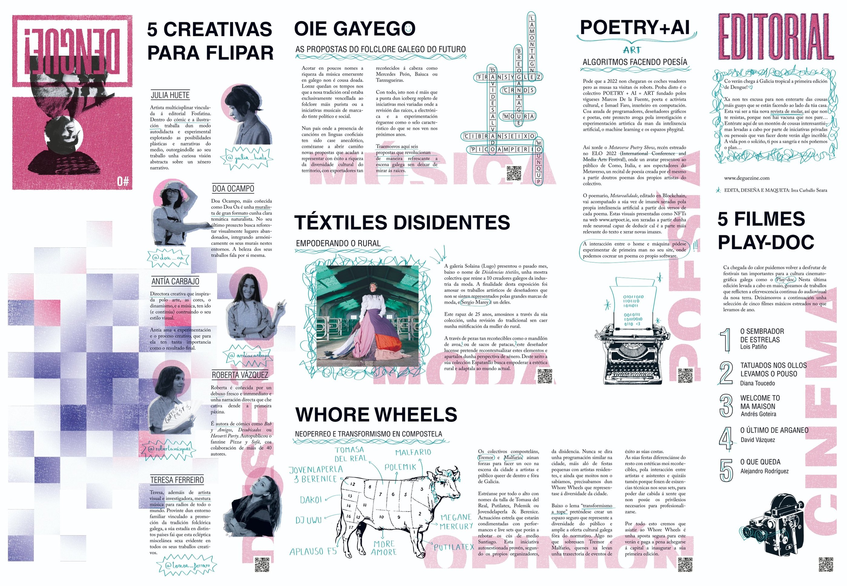
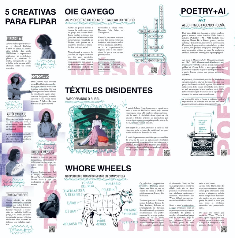
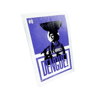
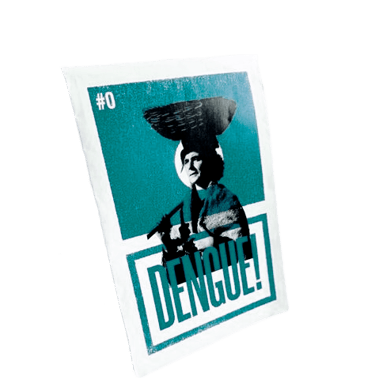
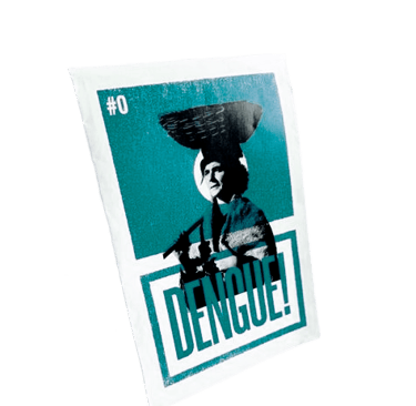
The chosen folding style is reminiscent of vintage maps. This type of design condenses 18 pages into a conveniently portable size. The reverse side features an artist's illustration, transforming it into a versatile poster when unfolded. This also adds a collectible value to the magazine.
ZINE LAYOUT

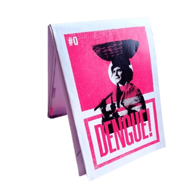


Front side (News)
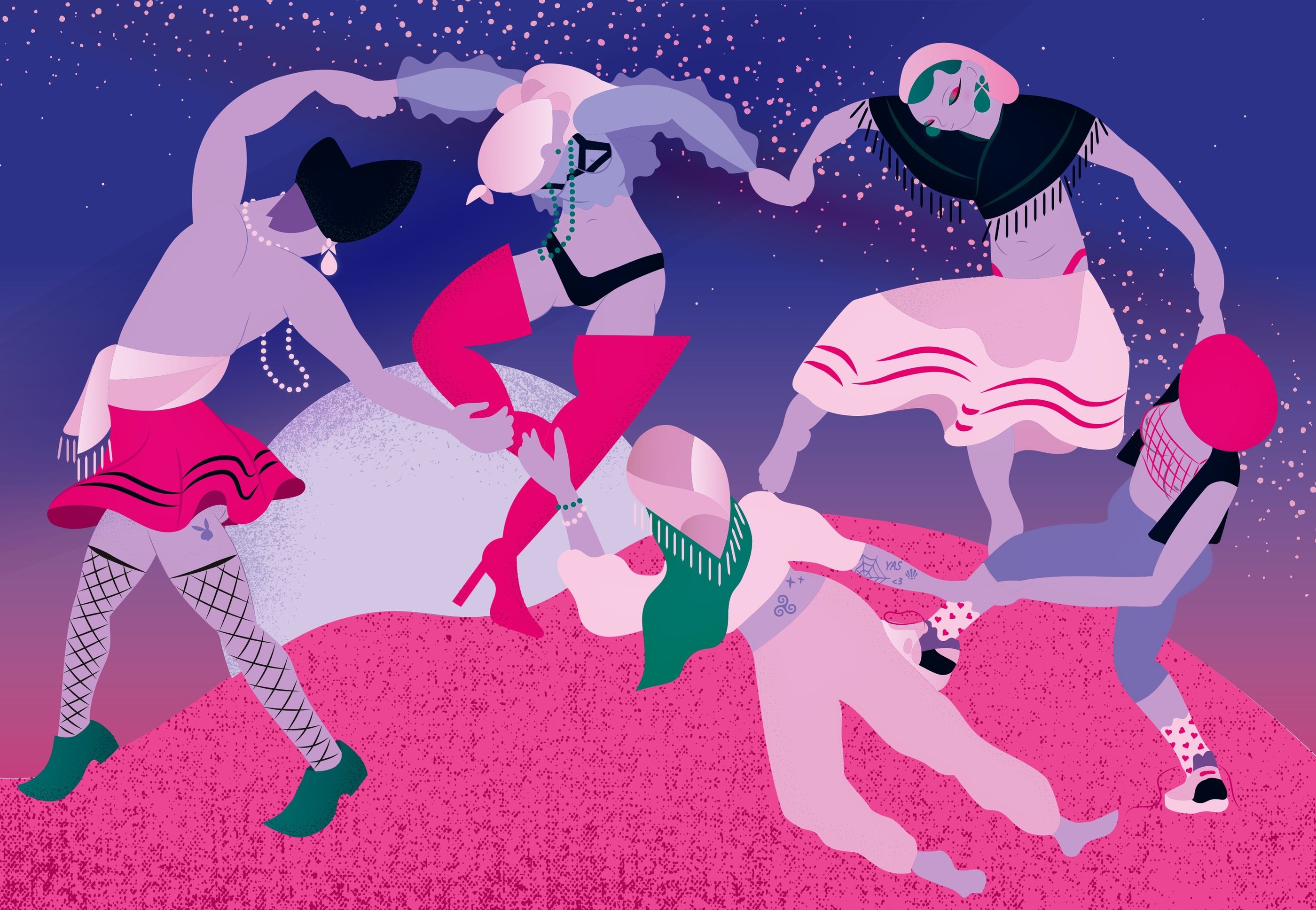
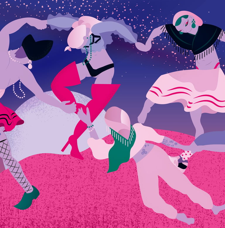
Back side (Poster)

GRAPHIC STYLE
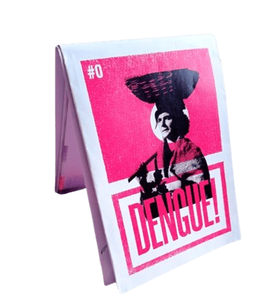
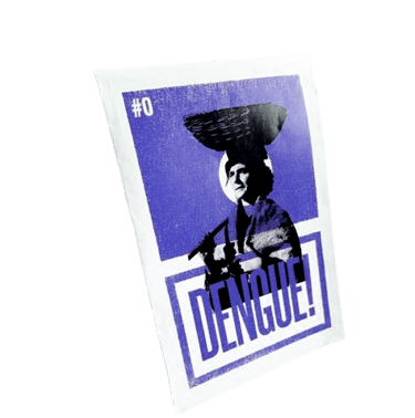
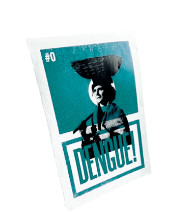
The most characteristic graphic element is the duotone effect. Pairing two contrasting colors lends a sense of cohesion to the entire publication while also delivering a visually striking impact. This distinctive trait is achieved through risographic printing, a technique reminiscent of the vibrant aesthetics found in 90s fanzines.
FUTURISTIC FOLK
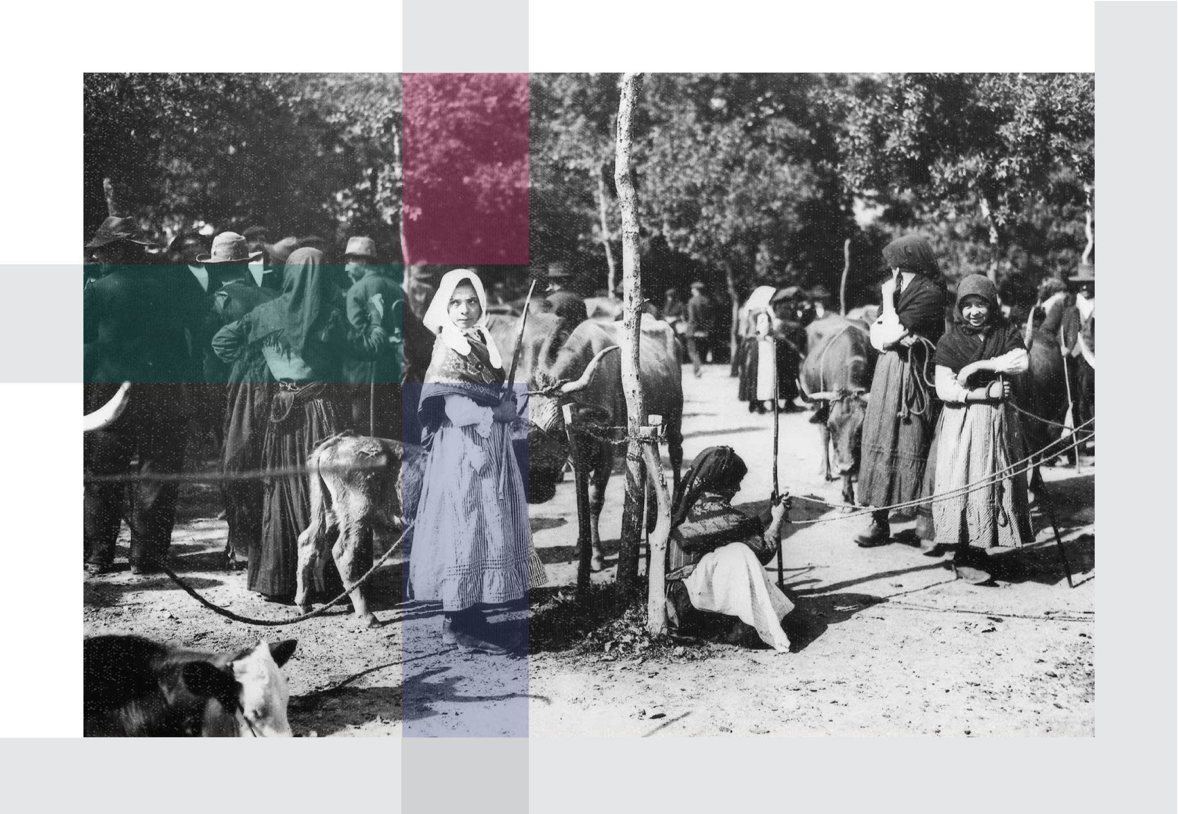
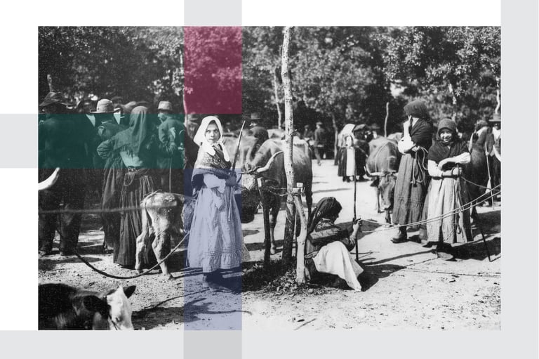
Design, layout, and writing of a cultural dissemination zine distributed in Galicia. This is an editorial project both physical and digital, aimed at promoting independent cultural initiatives that frequently go unnoticed in traditional media channels.This would include local artists, musicians, writers, artisans and other creative endeavors, fostering a sense of community engagement and appreciation for grassroots cultural contributions within the region.
DENGUE ZINE (2021)

02
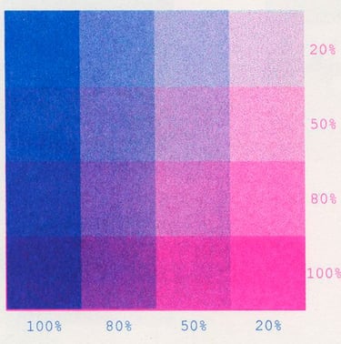
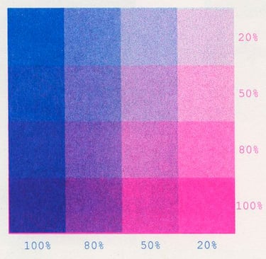
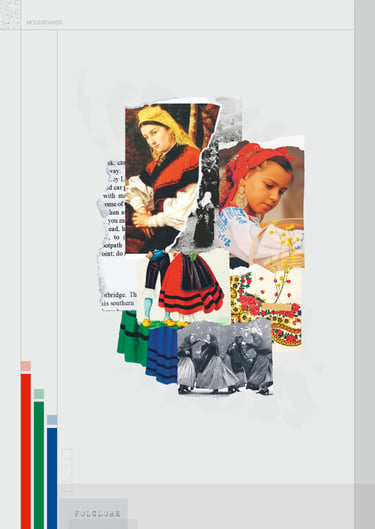
By doodling over preexisting content, we highlight and reinterpret popular concepts. This approach allows us to present these concepts in a language that resonates more deeply with our target demographic, bridging the gap between tradition and contemporary expression.

BRANDBOOK
A comprehensive guide to the visual identity, tone, and messaging that define the spirit of Dengue. Here, you'll find the essential elements that shape the brand, from logo usage and color palette to typography and imagery guidelines. By adhering to these standards, we ensure consistency and coherence between our digital and printed platforms.








GRAPHIC STYLE
The most characteristic graphic element is the duotone effect. Pairing two contrasting colors lends a sense of cohesion to the entire publication while also delivering a visually striking impact. This distinctive trait is achieved through risographic printing, a technique reminiscent of the vibrant aesthetics found in 90s fanzines.
FUTURISTIC FOLK


Design, layout, and writing of a cultural dissemination zine distributed in Galicia. This is an editorial project both physical and digital, aimed at promoting independent cultural initiatives that frequently go unnoticed in traditional media channels.This would include local artists, musicians, writers, artisans and other creative endeavors, fostering a sense of community engagement and appreciation for grassroots cultural contributions within the region.
DENGUE ZINE (2021)


By doodling over preexisting content, we highlight and reinterpret popular concepts. This approach allows us to present these concepts in a language that resonates more deeply with our target demographic, bridging the gap between tradition and contemporary expression.
02




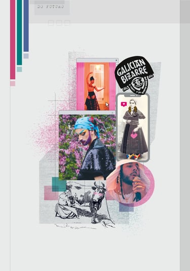
The chosen folding style is reminiscent of vintage maps. This type of design condenses 18 pages into a conveniently portable size. The reverse side features an artist's illustration, transforming it into a versatile poster when unfolded. This also adds a collectible value to the magazine.
ZINE LAYOUT
Front side (News)
Back side (Poster)

THE BRIEF
OBJET is a digital-native furniture brand targeting design-conscious professionals (30–50, North America, 65% female). The company had funding and ambition, but their existing brand kit wasn’t performing, which led to the need for a new visual identity.
The challenge: Elevate the brand to compete in premium modern furniture. Position OBJECT in the whitespace between Article (cheap modern) and RH (expensive traditional) — then build a visual identity that could hold that position.
Rebranding a luxury furniture e-commerce brand in record time, using AI as a research accelerator and creative exploration tool. AI helped speed up early research and made it easier to test multiple visual directions quickly, generating rough variations to explore what worked before refining the design.
Throughout the process, AI supported investigation and ideation, while decisions and final outcomes were guided by my own design criteria and fact-checking.
OBJET
AI POWERED REBRANDING (2026)
03
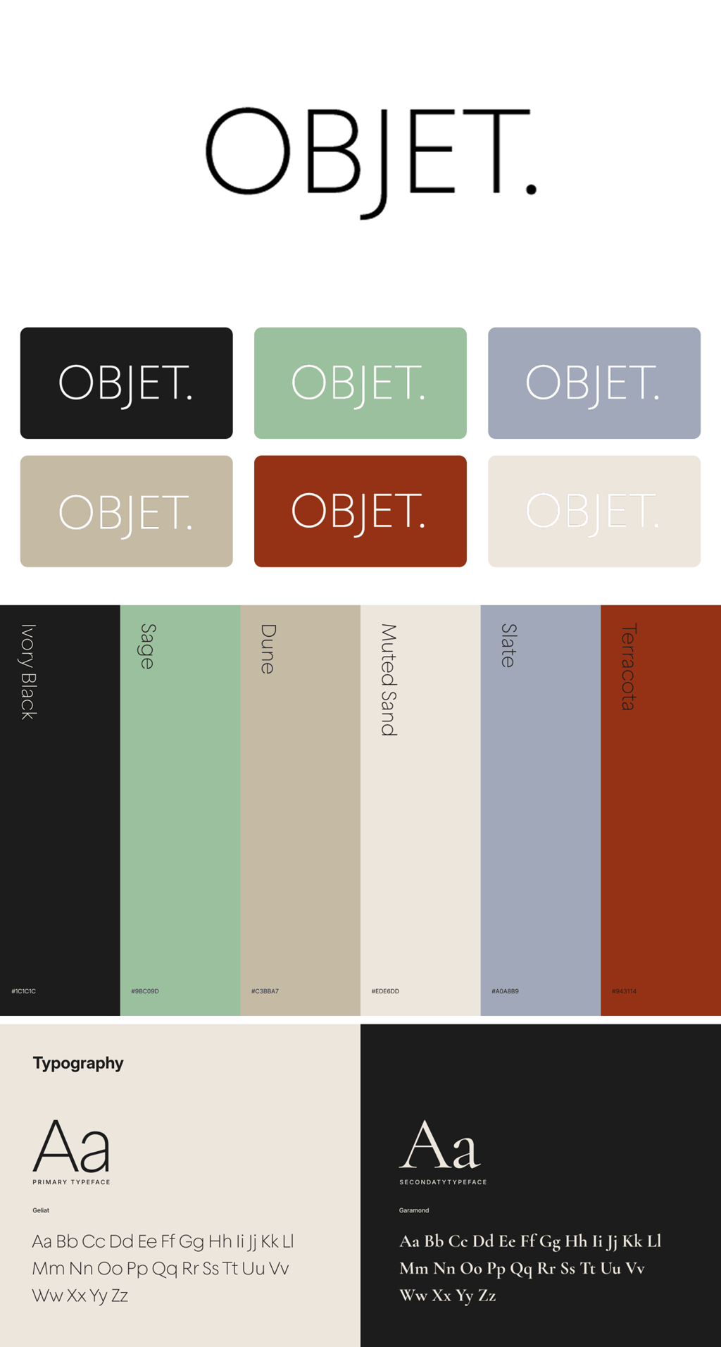
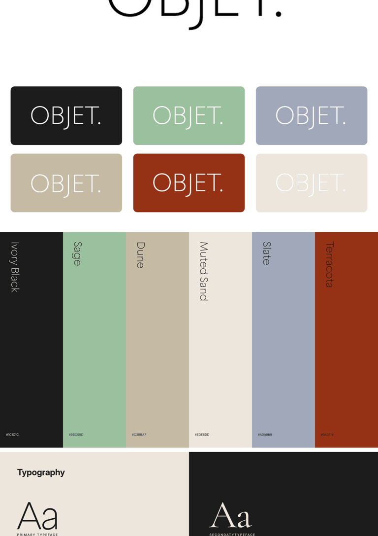
Original Brand Kit
New Brand Kit
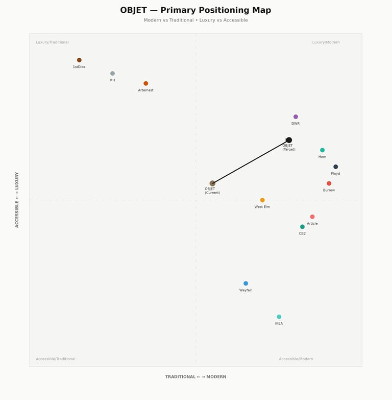
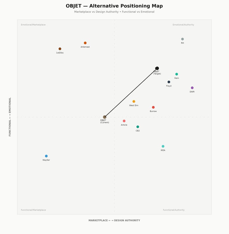
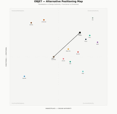
Axes Maps created with Claude
I used Claude to map 9 competitors across ultra-luxury (1stDibs, RH), modern DTC (Article, Burrow), and design authority (DWR, Hem) on positioning axes: Modern vs Traditional, Luxury vs Accessible.
The gap: 78% Modern / 68% Luxury — premium design without snobbery — was completely open. Article's quality is declining (reviews 4.2 → 3.8), RH alienates younger buyers.
Visual references: Menu, Ferm Living, Muuto proved sophisticated minimalism doesn't mean sterile. Strategic color (neutral base + intentional accents) informed OBJECT's palette: beige foundation with terracotta and slate as identity signals.
RESEARCH THAT
ACTUALLY MATTERED
CREATIVE DIRECTION
Based on the positioning gap, I explored multiple creative directions through Ideogram. Bold Minimalism with Strategic Color matched best.
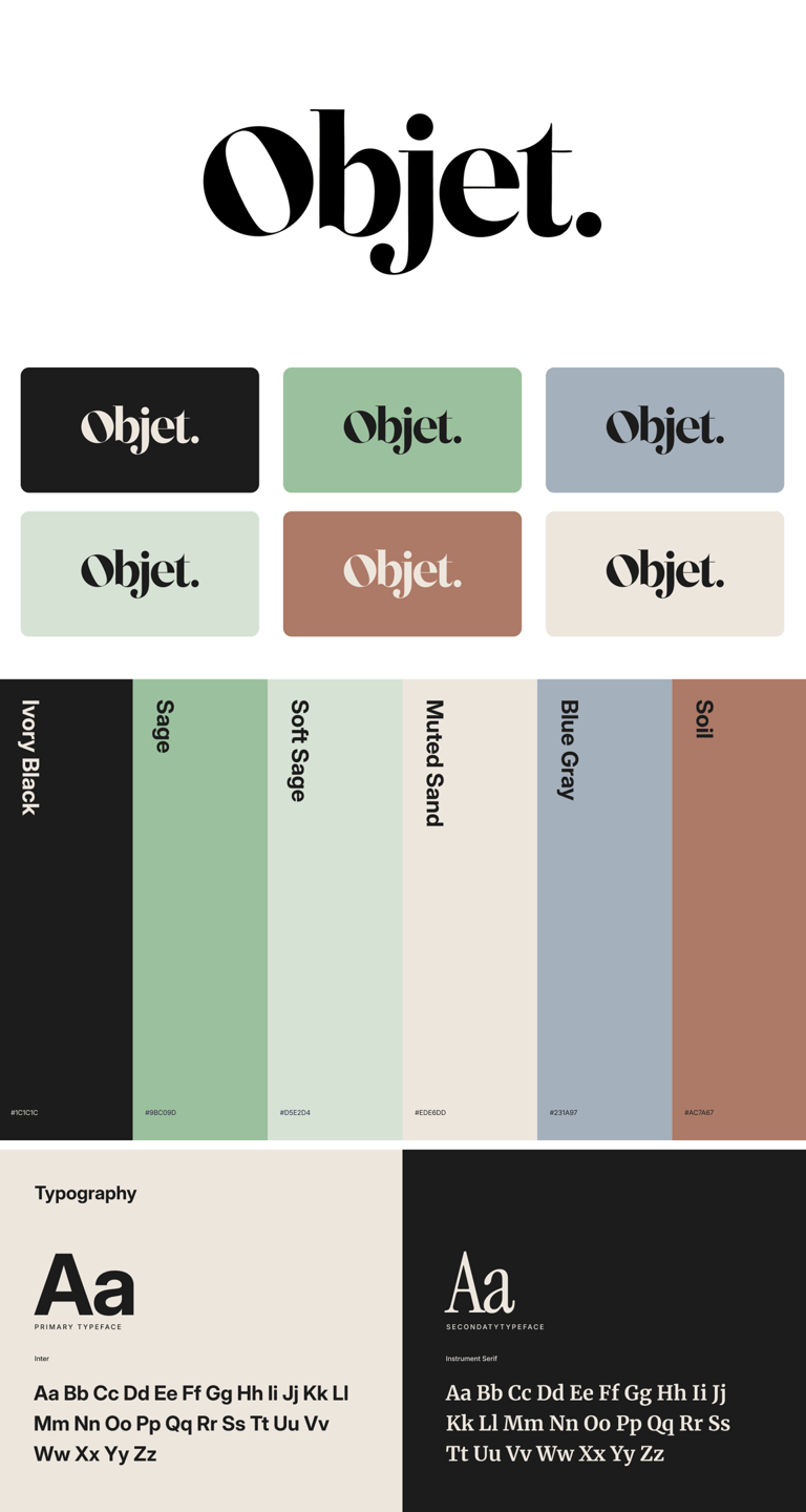
The original used Bodoni, high-contrast serif that reads fashion magazine, not design authority. For furniture (a considered purchase), this signals aspiration through exclusivity rather than trust through craft.
I moved to Geliat, a geometric serif with even stroke weight. Why it works:
Even strokes = stability and reliability. The brain processes uniform letterforms as more trustworthy and permanent.
Geometric construction = modern precision without coldness. Bridges warmth (serif) and clarity (geometry).
All-caps = authority without arrogance. Signals confidence and permanence, right for a brand selling $2,500+ sofas.
The period stayed. Adds decisiveness.
LOGO
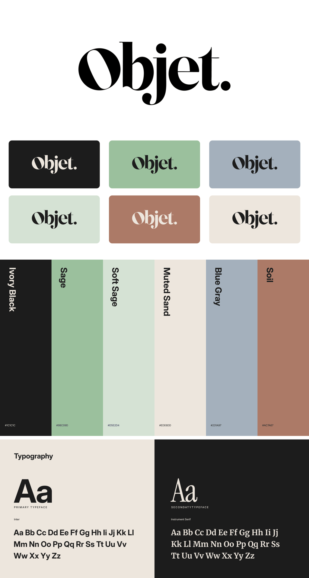
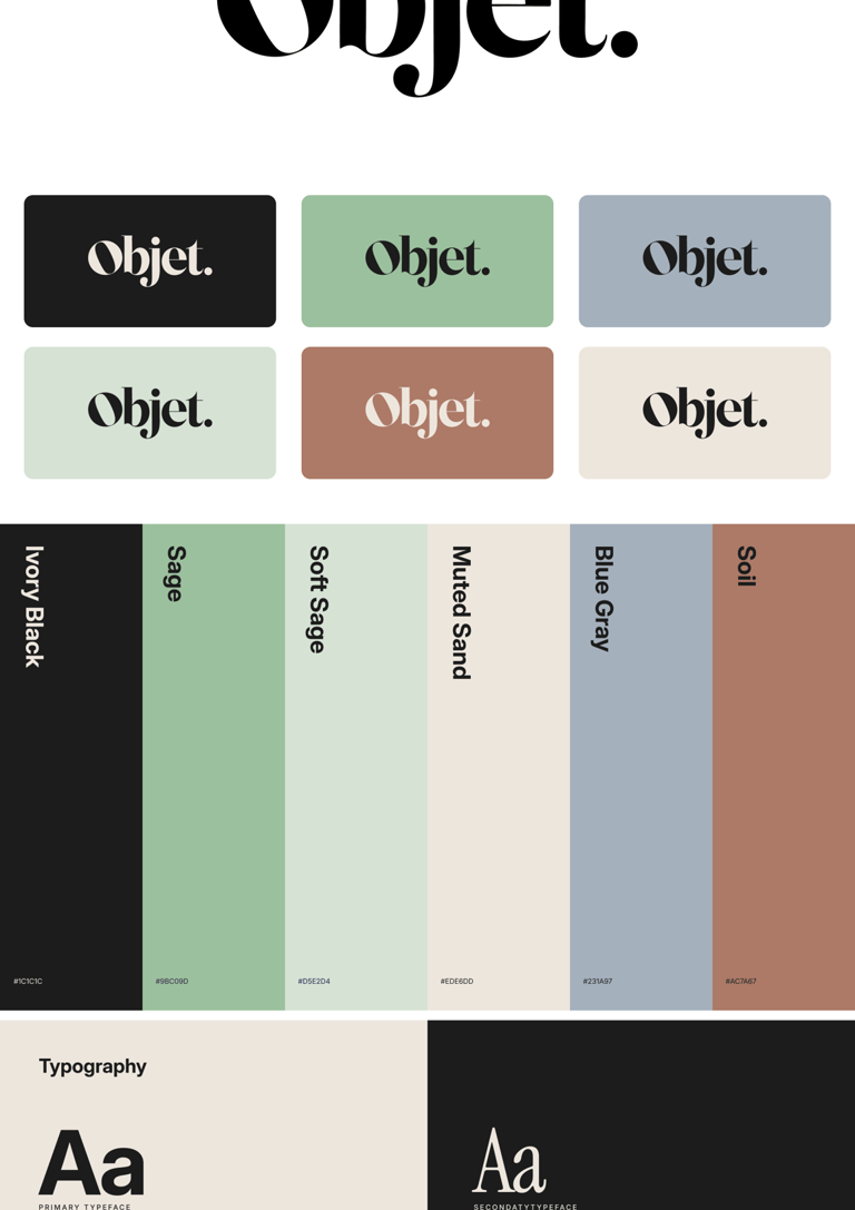
The original was all safe neutrals — invisible in a saturated DTC market. Neutral branding = forgettable branding. I expanded to a strategic system:
Foundation (Ivory Black, Muted Sand, Sage) = 60%. Earth tones signal quality, natural materials, longevity.
Accents (Terracotta, Slate, Dune) = 40%. Used intentionally, not decoratively. Terracotta = warmth and craft. Slate = authority without coldness. Mirrors HAY/Muuto: strategic color beats all-neutral for memorability.
Neutral-forward with personality. Serious about design, not boring about it.
COLOR PALLETE
The original used Inter + Instrument Serif ; functional but lacking personality. Safe, not strategic.
I proposed Geliat + Garamond:
Geliat (display): Geometric serif with even strokes. The brain reads uniform letterforms as more trustworthy and premium — critical for furniture branding.
Garamond (editorial): Classical serif with centuries of design credibility. Subconscious quality signal that adds warmth and authority.
Geliat = modern structure. Garamond = soul. The original was functional. The new system has a point of view.
Inter stayed for UI = invisible utility.
TYPOGRAPHY
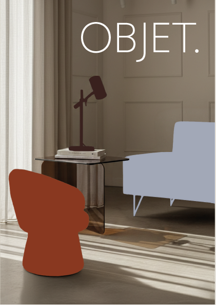
Explore how OBJET's visual identity translates across campaign touchpoints — from product imagery to Black Friday assets.


THE BRIEF
OBJET is a digital-native furniture brand targeting design-conscious professionals (30–50, North America, 65% female). The company had funding and ambition, but their existing brand kit wasn’t performing, which led to the need for a new visual identity.
The challenge: Elevate the brand to compete in premium modern furniture. Position OBJECT in the whitespace between Article (cheap modern) and RH (expensive traditional) — then build a visual identity that could hold that position.

Rebranding a luxury furniture e-commerce brand in record time, using AI as a research accelerator and creative exploration tool. AI helped speed up early research and made it easier to test multiple visual directions quickly, generating rough variations to explore what worked before refining the design.
Throughout the process, AI supported investigation and ideation, while decisions and final outcomes were guided by my own design criteria and fact-checking.
OBJET
AI POWERED REBRANDING (2026)



Axes Maps created with Claude
CREATIVE DIRECTION
Based on the positioning gap, I explored multiple creative directions through Ideogram. Bold Minimalism with Strategic Color matched best.
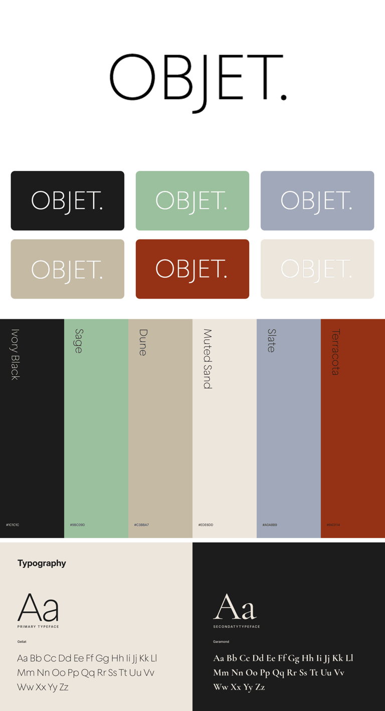
The original used Bodoni, high-contrast serif that reads fashion magazine, not design authority. For furniture (a considered purchase), this signals aspiration through exclusivity rather than trust through craft.
I moved to Geliat, a geometric serif with even stroke weight. Why it works:
Even strokes = stability and reliability. The brain processes uniform letterforms as more trustworthy and permanent.
Geometric construction = modern precision without coldness. Bridges warmth (serif) and clarity (geometry).
All-caps = authority without arrogance. Signals confidence and permanence, right for a brand selling $2,500+ sofas.
The period stayed. Adds decisiveness.
LOGO
03
RESEARCH THAT
ACTUALLY MATTERED
I used Claude to map 9 competitors across ultra-luxury (1stDibs, RH), modern DTC (Article, Burrow), and design authority (DWR, Hem) on positioning axes: Modern vs Traditional, Luxury vs Accessible
The gap: 78% Modern / 68% Luxury — premium design without snobbery — was completely open. Article's quality is declining (reviews 4.2 → 3.8), RH alienates younger buyers.
Visual references: Menu, Ferm Living, Muuto proved sophisticated minimalism doesn't mean sterile. Strategic color (neutral base + intentional accents) informed OBJECT's palette: beige foundation with terracotta and slate as identity signals.
Original Brand Kit
New Brand Kit
COLOR PALLETE
The original was all safe neutrals — invisible in a saturated DTC market. Neutral branding = forgettable branding. I expanded to a strategic system:
Foundation (Ivory Black, Muted Sand, Sage) = 60%. Earth tones signal quality, natural materials, longevity.
Accents (Terracotta, Slate, Dune) = 40%. Used intentionally, not decoratively. Terracotta = warmth and craft. Slate = authority without coldness. Mirrors HAY/Muuto: strategic color beats all-neutral for memorability.
Neutral-forward with personality. Serious about design, not boring about it.
TYPOGRAPHY
The original used Inter + Instrument Serif ; functional but lacking personality. Safe, not strategic.
I proposed Geliat + Garamond:
Geliat (display): Geometric serif with even strokes. The brain reads uniform letterforms as more trustworthy and premium — critical for furniture branding.
Garamond (editorial): Classical serif with centuries of design credibility. Subconscious quality signal that adds warmth and authority.
Geliat = modern structure. Garamond = soul. The original was functional. The new system has a point of view.
Inter stayed for UI = invisible utility.
Explore how OBJET's visual identity translates across campaign touchpoints from product imagery to Black Friday assets.
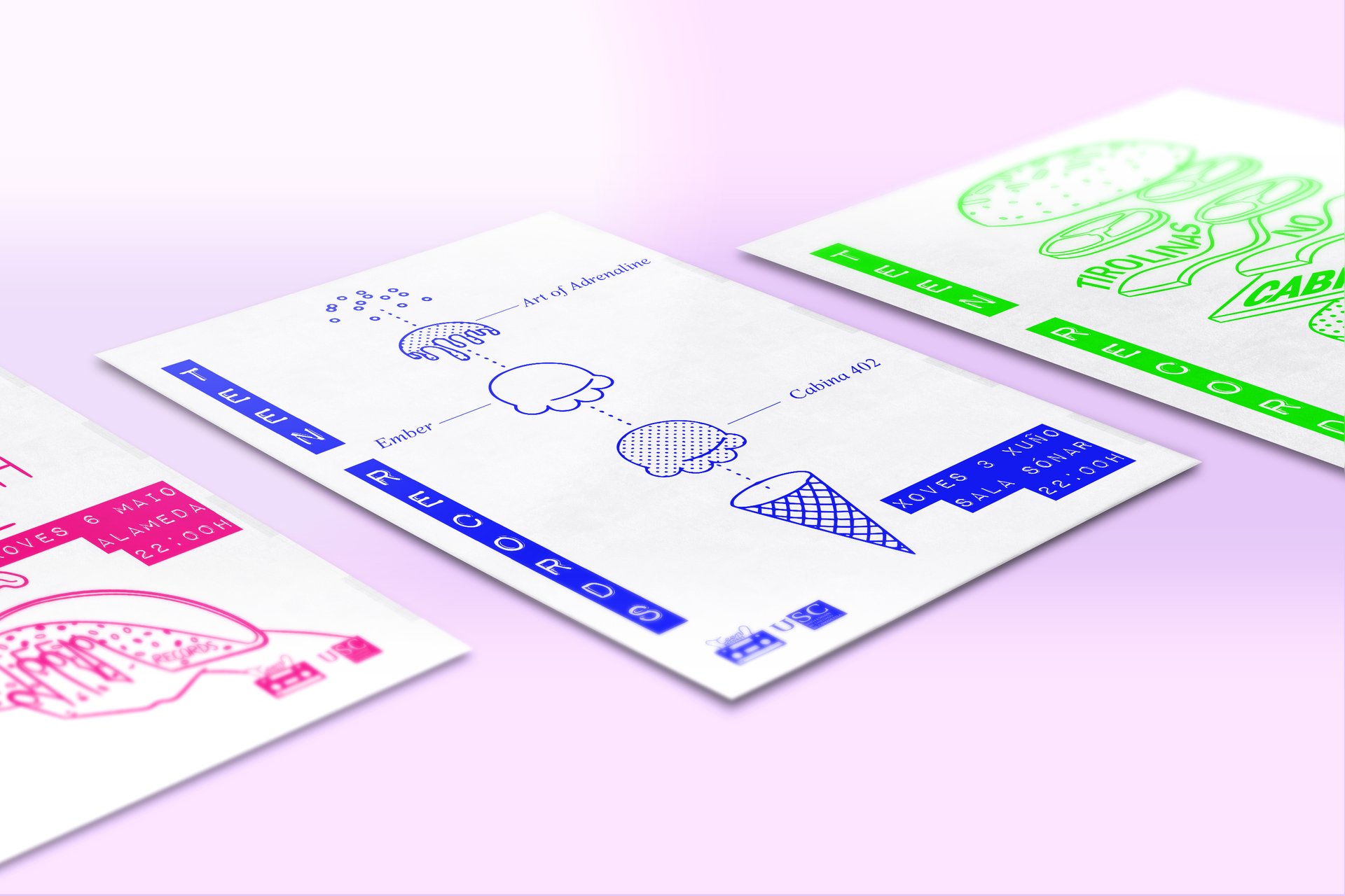
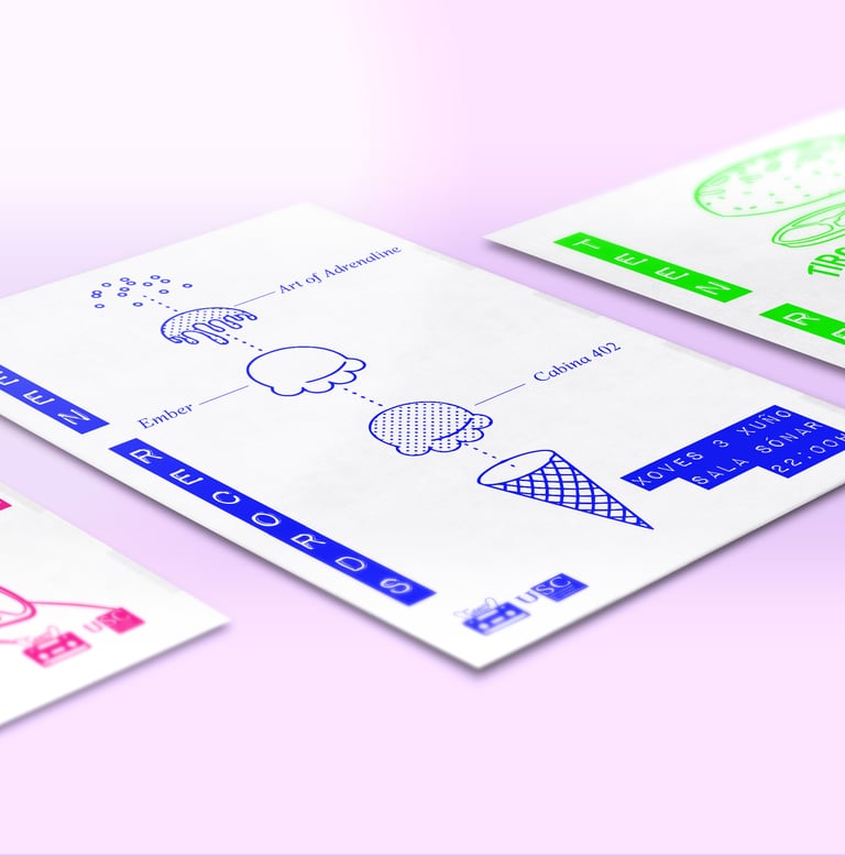
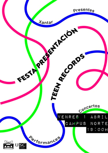
Teen Records is a record label affiliated with the University of Santiago de Compostela, which emerged in 2016 from a collective end-of-degree project. It is a proposal specialized in scouting, recording, production, distribution, and promotion of teenage musicians' talent in Galicia.
My contribution involved building a visual identity in collaboration with the communication and marketing departments.
TEEN RECORDS (2016)
04
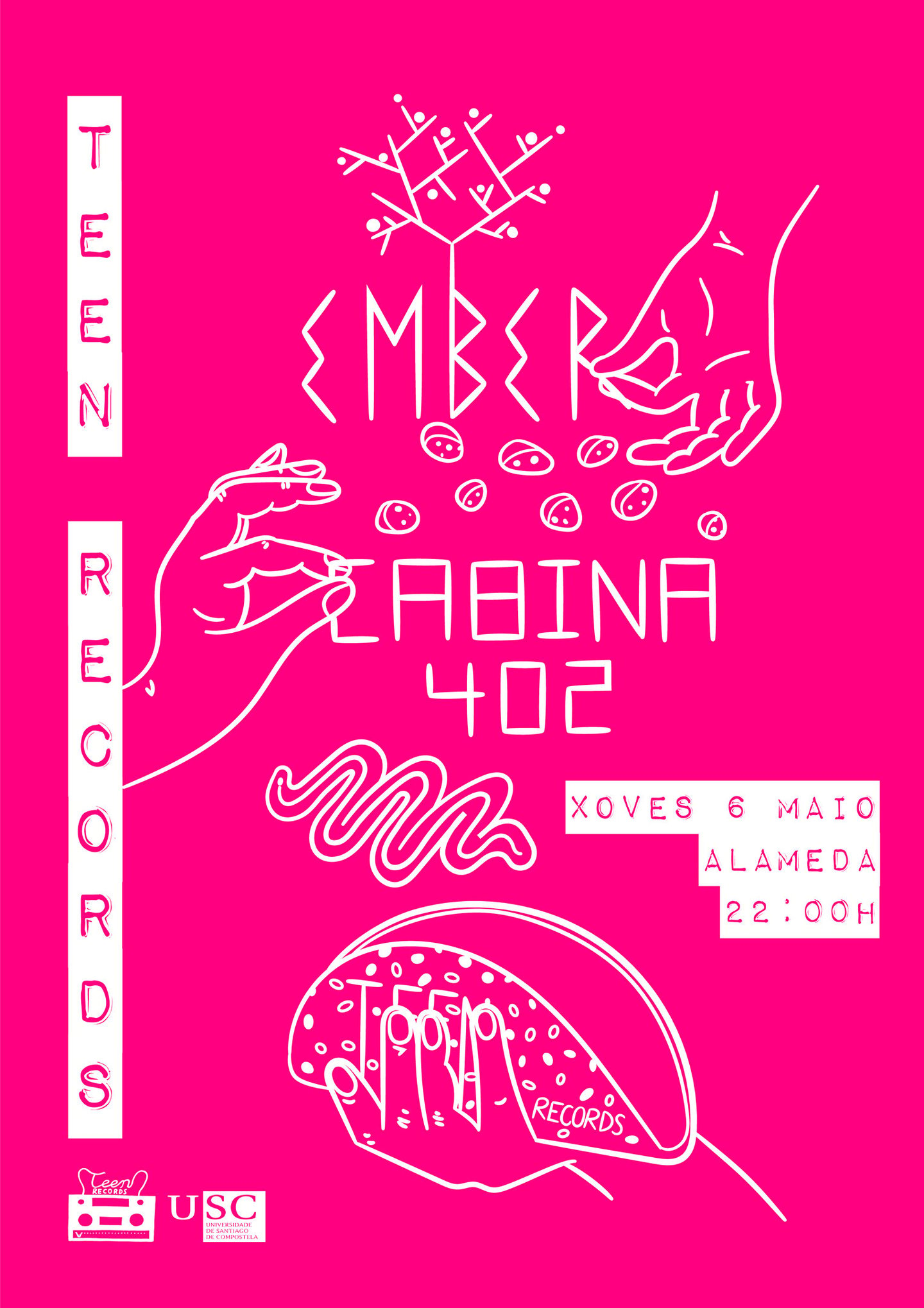
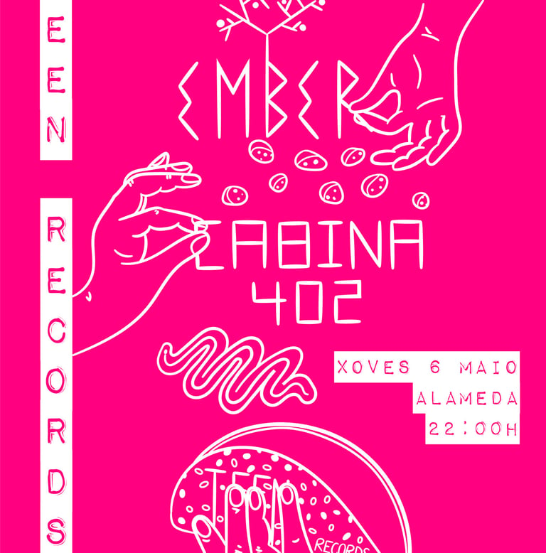

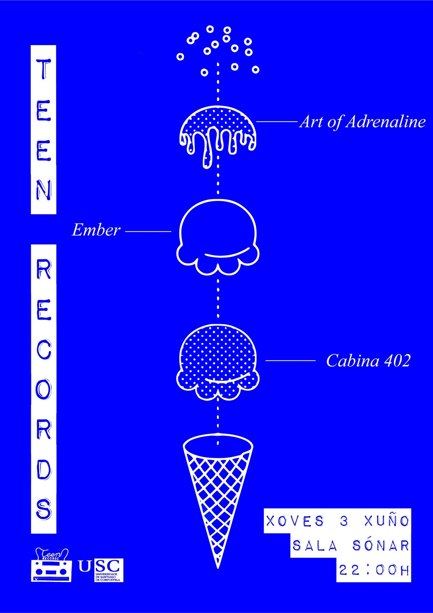
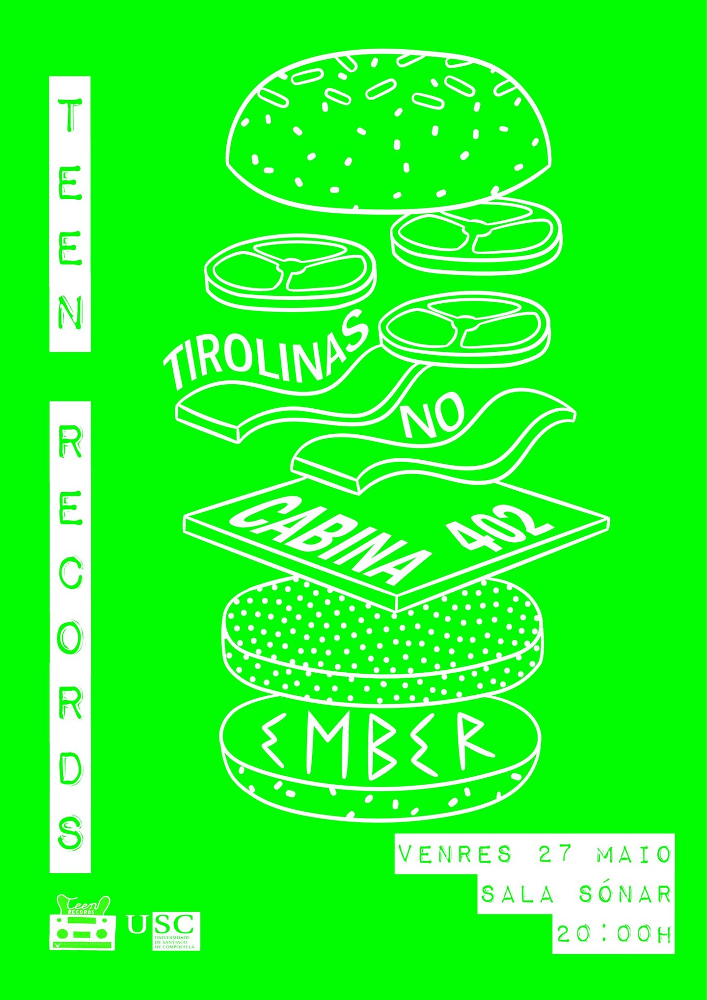
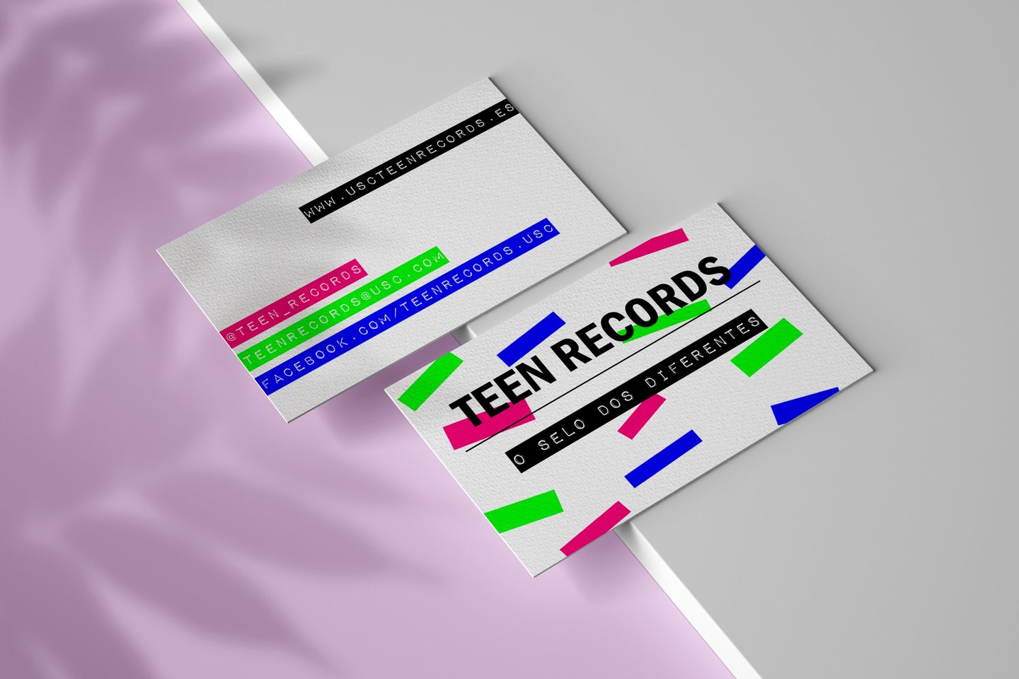
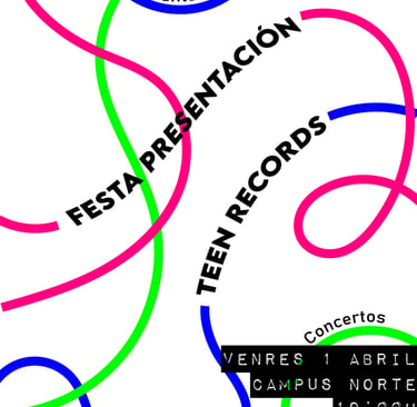
The graphic style of Teen Records is informal and relaxed, in accordance with the label's target audience. A color palette with high saturation was agreed upon, creating a colorful and youthful visual contrast.



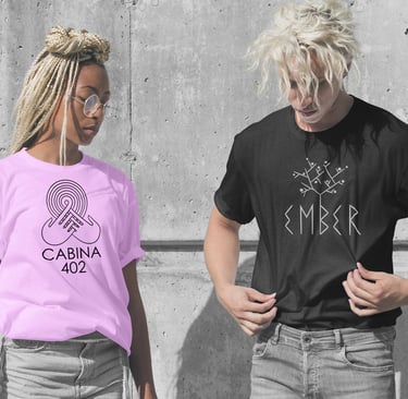


Teen Records is a record label affiliated with the University of Santiago de Compostela, which emerged in 2016 from a collective end-of-degree project. It is a proposal specialized in scouting, recording, production, distribution, and promotion of teenage musicians' talent in Galicia.
My contribution involved building a visual identity in collaboration with the communication and marketing departments.
TEEN RECORDS (2016)
04

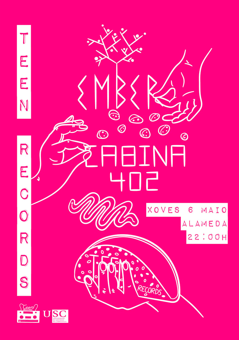

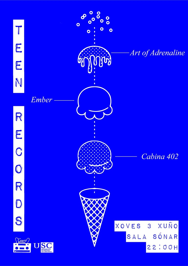

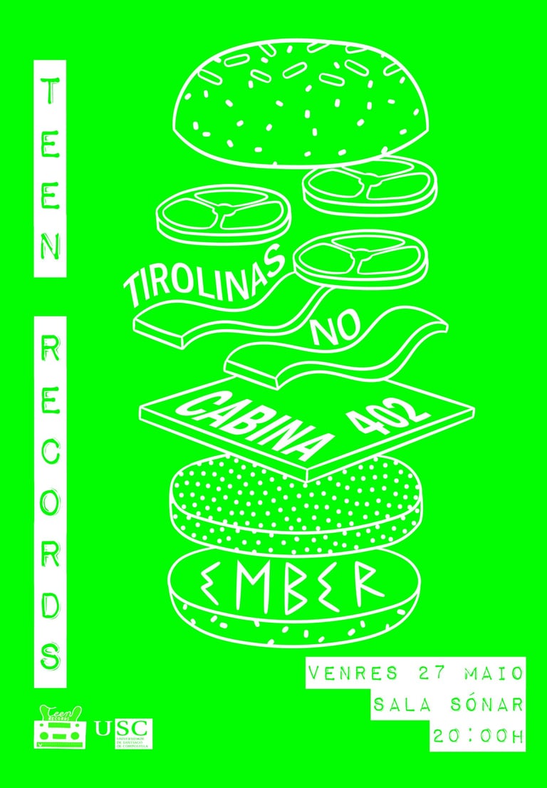

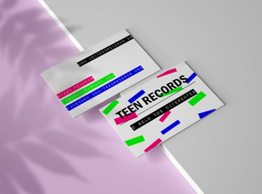
The visual style of Teen Records is informal and relaxed, in accordance with the label's target audience. A color palette with high saturation was agreed upon, creating a colorful and youthful visual contrast.

